“The UX audit brought to light areas we could improve and the redesign improved them. We’re thrilled with the new site and the results we’re seeing. It helps us tell our story of a caring, local medical center that has the experience and ability to compete with the larger systems.”
Jessica Carter, Marketing & Digital Communications Specialist
Mary Greeley Medical Center
Mary Greeley Medical Center is a 220-bed regional hospital that provides healthcare to the residents of a 13-county area in central Iowa. While it serves many nearby rural communities, it also competes with larger healthcare organizations in the Des Moines metro area. Their marketing team knew that to retain and attract patients, their website needs to deliver an online experience that meets or exceeds the experience of much larger competitors.
When the medical center was approaching an upcoming redesign with their digital agency Geonetric, they decided to start with a user experience audit. It helped identify areas to capitalize on to better engage site visitors – particularly mobile users.
Deep dive into analytics
Using Google Analytics, scroll tracking, heat mapping, click mapping, and user survey feedback, the Geonetric team analyzed how site visitors arrive at the site and interact with its content and functionality there. The team evaluated user paths from the home page to high priority areas, how visitors use navigation and search, as well as engagement and conversion data on location, services, and provider pages.
The findings from the audit revealed priority opportunities to:
- Improve the mobile user experience
- Implement a system-wide approach for location content
- Strategize labeling and their A to Z services listing for more clarity
- Make calls to action more prominent for both desktop and mobile users
There were additional recommendations to refresh content to make it more user-focused and improve accessibility to comply with WCAG 2.0 guidelines for color usage.
Armed with these recommendations and ideas, the Mary Greely and Geonetric teams got to work on the redesign.
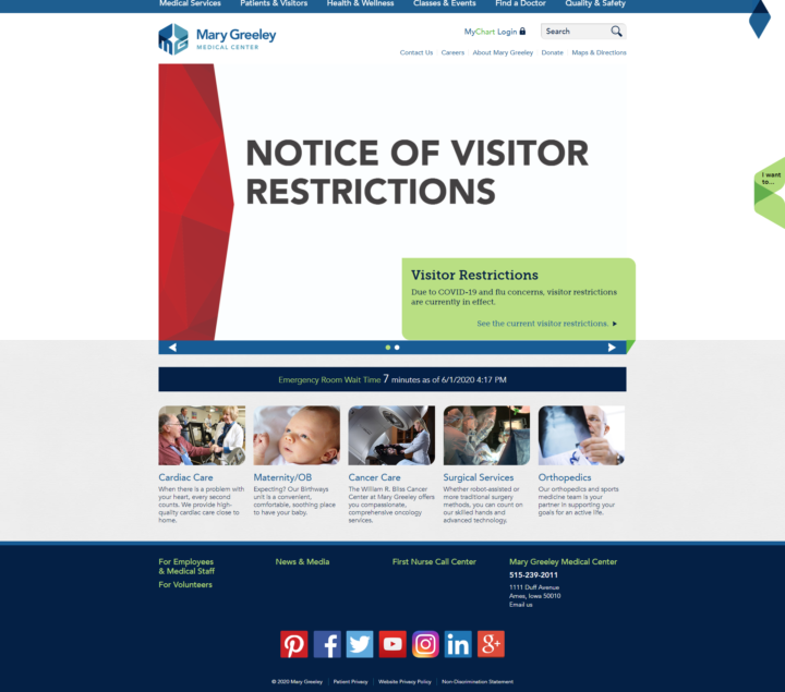
Redesign focuses on more modern user experience
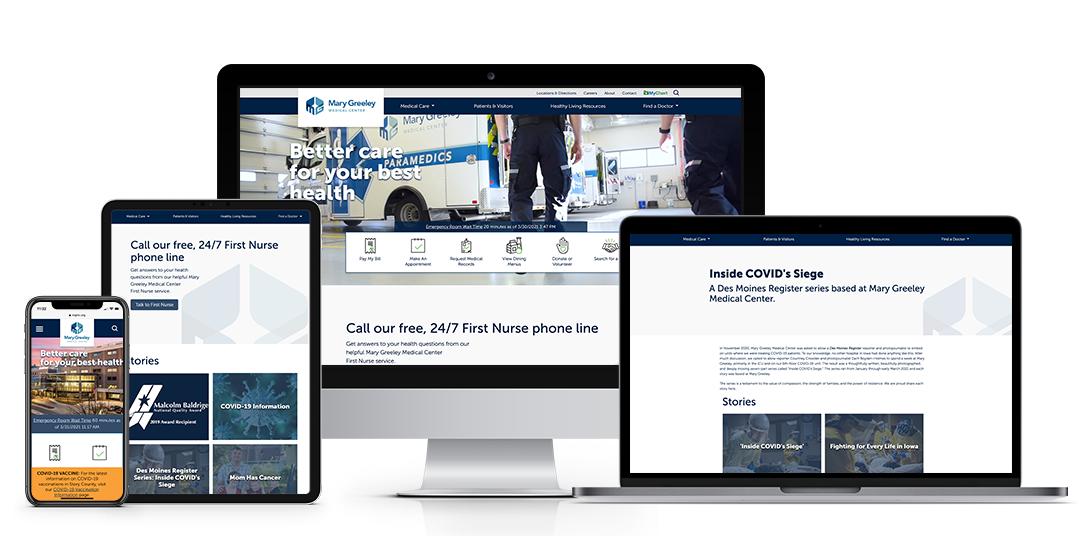
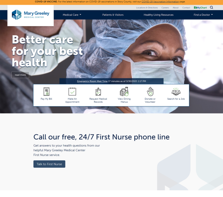
The new website is built on the VitalSite content management system and marketing platform and delivers an updated, modernized experience. Through a hero banner video, eye-catching icons that highlight top tasks, and large fonts that promote the organization’s free, 24/7 First Nurse phone line, priority information is front and center above the fold. The design was also WCAG 2.0 compliant at launch.
The new main navigation features expandable mega-menus with dropdowns, icons, and built-in search, helping users quickly find what they are looking for both priority service lines and providers. The new information architecture and menu items are optimized based on engagement metrics and to avoid redundancy.

The site also boasts refreshed content and internal section structures that reflect their UX audit findings, content strategy best practices, and the organization’s strategic communications goals. Mary Greeley’s writers received healthcare and web writing training from Geonetric’s content experts, as well as a round of feedback on new copy they’d written according to the training, giving them an opportunity to practice their new skills.
In an effort to make tracking and more iterative site enhancements a priority, Mary Greeley and Geonetric created a new Data Studio Dashboard where the Mary Greeley team can keep a watchful eye on numbers that align with their KPIs – particularly around acquisition, engagement, demographic and traffic channels.
Improved results across the board
Since launch, the site has enjoyed impressive results, including:
- A 22% increase in overall sessions
- A 15% increase in sessions to the providers section
- People continue to turn to you as a source of truth with users and new users increasing by 25% and 28%, respectively
- Engagement overall in the services section is now higher than industry averages
- Desktop and mobile traffic has increased by 22% and 23%, respectively
In addition, the site received an honorable mention award from the 2020 MarCom competition in the Website-Medical category.
User Experience Audit Sets Medical Center Website Redesign Up for Success
