
“From design to content and everything in between, the Geonetric team delivered on our redesign goals. VitalSite has the built-in features and functionality we need to be competitive while ensuring an excellent user experience for our site visitors.”
Maryanne Boster, Director, Corporate Communications
Virginia Hospital Center
Virginia Hospital Center (VHC) has provided exceptional medical services to the Washington, DC metropolitan area for more than 75 years. With intense competition in the area, VHC wanted to update their digital presence. It had been more than 15 years since the organization redesigned or upgraded platforms, and the site wasn’t delivering an optimal experience for mobile visitors or integrating with the MyVHC Epic patient portal.
That’s why VHC turned to Geonetric to help build a site that better represents their brand, delivers an intuitive user experience for both desktop and mobile visitors, and offers features and functionality that surpasses the competition.
Telling the story of VHC through design and content
One of the main goals of the new site was to align the web with existing marketing materials to create a cohesive experience and improve brand awareness. Since it had been 15 years since the site had been refreshed, it was important to establish a new online presence that better reflected the award-winning and top-notch services patients receive at VHC.
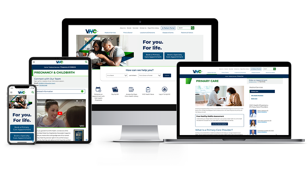
VHC’s traded in a copy-heavy homepage for a simplified design that uses an accessible color palette consistent with existing marketing materials, images with a slight gradient to create a feeling of warmth and create unity across the site, and clear icons that draw visitors in. A large hero image promotes VHC’s tagline and the minimalist design allows colors to stand out against the mostly white background. For example, the Find A Doctor search is prominently displayed on the homepage with the blue background color capture visitors’ attention and aiding in increased patient volume by putting health consumers on a direct path to getting care.
The unique treatment to the letter V in VHC’s logo is used to break up sections on the homepage, reinforcing the brand and helping to draw the user’s eye down the page to additional information. Small micro-interactions are used on the homepage, such as boxes that appear on hover or arrows that animate on hover. These add movement and interactivity to the design, gently encouraging users to click and explore more.
Previously VHC had a separate site for mobile, creating a disconnected experience. The new site is responsive and an important step forward as the organization focuses on engaging mobile site visitors.
It was also important to ensure the site is a useful resource where users can easily find information. This was accomplished through both design and information architecture. For example, the eye-catching quick links panel on the homepage uses icons to highlight top user tasks, making it simple for visitors to pay bills, access health education, log in to MyVHC, and find a job.
Geonetric writers worked with VHC to identify what types of content updates were needed for each service line section by launch. For six high-priority sections, Geonetric worked with VHC subject matter experts to create new, robust website content about programs, services and key differentiators. For another 36 sections, Geonetric revised existing content to bring it in line with current web writing best practices and the organization’s brand updates.
Both approaches included writing metadata to improve SEO, developing calls to action to support conversions, and ensuring content is readable, accessible, and patient-focused. This two-tiered approach to content development meant that VHC was able to launch its website with crucial content updates while staying within the project’s timeline and budget.
New platform delivers key features and functionality
Moving to the VitalSite content management system (CMS) helped VHC quickly catch up to software, functionality, and user experience best practices. Since the CMS is built for healthcare systems the Find a Doctor, Locations, and Services directories met all of VHC’s needs out of the box, with engaging provider and location profiles that have Schema.org built-in. Key content is cross-promoted throughout the site via panels and SmartPanels, so VHC Physician Group providers automatically show up on service line pages. The Classes & Event directory helps VHC promote numerous classes, support groups, and community events.
Building on VitalSite also meant VHC’s site is mobile-ready with a responsive design, fast-loading thanks to lightweight code, and delivers an inclusive experience, being WCAG 2.0 compliant at launch.
Highlighting the Mayo Clinic connection
VHC is a proud member of the Mayo Clinic Care Network, a national network of independent healthcare organizations. The new design helps bring attention to that partnership through the navigation, a logo in the footer, as well as through panels and callouts on key pages. Geonetric was mindful of adhering to Mayo Clinic’s brand standards.
Adding the Mayo Clinic Health Library to the site also helped solidify that connection, and gives VHC site visitors access to extraordinary expertise from one of the world’s leading medical centers, all while enriching VHC’s online health resources.
Increasing engagement, traffic across the board
Since its launch, VHC is enjoying numerous improvements. Sessions have increased by 11.7%, users have increased by 13.0%, and page views have increased by 28.8%. When looking at engagement metrics, pages per session increased by 15.3%, average session duration has increased by 5.7% and bounce rate has decreased by 37.5%, which is 11% lower than the average bounce rate in the healthcare industry.
VitalSite’s Dashboard presents important high-level analytics data such as total site sessions and session breakdowns, top pages including providers and locations, module traffic and engagement, along with form conversions and events, and mobile vs. desktop usage. This helpful feature allows VHC to easily monitor high-level metrics.
The site improvements have also made an impact on traffic acquisition. Since launch, organic search traffic has increased by 14.7% when compared to the previous period and accounted for nearly 41,000 total sessions. Direct traffic has increased by 19.1% when compared to the previous period. Referral traffic increased by 38.0% when compared to the previous period.
Redesign Helps Health System Stand Out in Competitive Market


