As a healthcare marketer, you likely have been investing in ways to make your website more SEO-friendly as well as more accessible to people with disabilities. And once you start reviewing your site, no doubt the issue of missing or incomplete alt text comes up, especially if you have ran your site through an automated SEO or accessibility tool. Wondering how to fix it and adhere to WCAG standards. Read on.
The good news is that Geonetric is here to help. Let’s start with the basics.
What is alternative text and why do I need it?
People who have low vision or who are blind typically use assistive technology called screen readers. A screen reader does exactly what it sounds like: It reads what is on the screen. Proper HTML markup is important so that screen readers announce things properly.
When a screen reader encounters an image, it says a phrase like “graphic,” followed by whatever text is added as the alternative text, also known as alt text. If this alt text does not exist, some screen readers will try to guess what the image is by reading the file name.
By applying alternative text to your images, you’ll help people with low vision or blindness understand the context (and content) of the page. Often in healthcare marketing, we add images to pages to elicit an emotional response, or tie the content together in a visual way. For people who can’t see the content or pictures, an alternative text description can help fill that gap.
Alternative text is necessary for screen readers, but it also:
- Displays if a person disables images from loading
- Displays if a path to an image is broken
- Helps web crawlers understand what your image is about so it can be properly indexed
How do I add alternative text?
There are multiple ways to add alternative text to images, but the most common method is to use the alt attribute. In HTML, you’ll find the alt attribute looks like this:
<img src="image.gif" alt="This is alternative text" />
When using a content management system (CMS) like Vitalsite, WordPress, or Drupal there is typically a field to enter alt text when adding an image to a page. Then, the CMS generates the HTML markup.
How do I write good alt text?
Writing good alt text is a bit of an art form. Your goal is to write a description that gives a blind user an equivalent experience to a sighted user—not more, not less. It’s also important to take into consideration the context of why the image is on the page in the first place.
For example, a page about a birth center may have an image of a sleeping baby. In this instance, “sleeping infant” may be all that’s necessary to describe the image.
Now let’s take that same image and put it on a page titled “Safe Sleeping for Infants.” This time, instead of “sleeping infant,” you may need to say “Infant, laying on her back in a crib,” so the image has more appropriate detail on context with the topic.

Alternative text best practices
When it’s time to add images to your page or website, or you’re ready to go back and fill in all your missing alt attributes, keep these best practices handy:
1. Don’t include “This is an image of…” in your alternative text. Screen readers will announce “image” or “graphic” before reading the alternative text. Adding “Photo of…” is redundant and clunky to the user’s experience.
However; an exception to this rule applies if you’re describing a work of art and its context is vital to the experience. You’ll see alternative text for art such as, “Sculpture of David by Michelangelo” or “Lithograph by M. C. Escher titled Drawing Hands.”
2. Describe only what you see. Avoid attempting to interpret feelings or emotions, or provide more information than a visual user would receive.

Take for instance the above image. This image’s alt text could say, “Nurse talking to an elderly couple at Benefit Health Cancer Center.” However, this is providing more information than a visual user would get. Why? Because the image doesn’t explicitly state where this scene is taking place. This couple could be at home, or in an assisted living facility. We also don’t know if this is a “cancer” discussion or just an at-home visit. Remember: If it’s not obvious to a sighted user, don’t include it in the alt text. We’re aiming to deliver an equal experience to all by allowing the user to interpret images based on their journey and emotions.
3. Don’t keyword stuff your alternative text. Alternative text, like the other text on your site, should be realistic and human, and simply describe the image. Keyword stuffing is a black hat practice and won’t get you any points with the search. In the end, it just delivers a poor experience to people using a screen reader.
4. Avoid abbreviations or technical terms. Again, like other content on your site, you should be considering the health literacy and experience of the real people using your site, particularly patients and healthcare consumers. Medical jargon and abbreviations might mean something to your doctors, but they’re not so clear to a patient or someone with lower health literacy. Aim for clear, people-friendly terminology that’s easy to understand.
5. Keep the alternative text concise, approximately 250 characters or less. Use a character counter in your word processor or through tools online to check the length and stay within best practices. You won’t be penalized if you go over this amount, but it will likely annoy people using a screen reader.
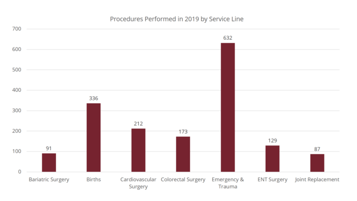
6. Complex images may need more consideration. Detailed and complex images, like charts and graphs, may require more than the “best practice” 250 characters to adequately describe the image. In these cases, it’s best to give a brief description in the alt text, followed by a long description. There are several different ways to accomplish this, but the easiest is by adding a few paragraphs of text describing the chart directly on the page.
Your alt text may be something like “Bar chart of procedures for the year. A detailed description follows.” Then, after the chart, you would add as much text as necessary to accurately describe it, listing each month and the number associated with it.
Example:
<img src="/images/chart.png" alt="Bar chart of procedures performed in 2019 by service line. Detailed description to follow." />

In 2018, Benefit Health performed 1,660 procedures and surgeries. This data represents a breakdown of seven critical departments responsible for these procedures. This data is captured through daily statistics throughout the healthcare system. The surgeries performed are as follows:
- Bariatric surgery, also known as weight loss surgery: 91
- Births in the birth center: 336
- Cardiovascular (heart) surgery: 212
- Colorectal surgery: 173
- Emergency and trauma procedures: 632
- Ear, nose, and throat surgeries: 129
- Joint replacement (knee, shoulder, etc.): 87
Not only does this help people who are blind, but it also helps those patients or healthcare consumers who may have a hard time understanding charts.
7. Avoid using images of text. However, in rare instances (such as logos or word art), the alternative text should match the text in the image.
8. For images that are buttons, the alt text should describe the action. For example: If you have a form that uses an image of an arrow as the button to submit the form, the alternative text for the image should say “Submit,” rather than “arrow pointing right.”
9. For images that are links, the alt text should describe the destination. Do not include alt text that says “link to…” because screen readers will announce “link graphic” before the alternative text.
One common example is using Facebook’s “f” logo as a link to your organization’s Facebook page. In this instance, the alternative text should not be “Facebook logo” but instead “[Organization name] Facebook page”.
Does every image need alternative text?
No, not every image needs alternative text. If the image is purely decorative or redundant to the content on the page, then the alternative text is unnecessary. In these cases, keep the alt attribute empty.
How do I know if an image is decorative?
If you’re using our VitalSite CMS, most instances of decorative or redundant images are handled at the template level. This means your developers at Geonetric already did the hard part for you.
The majority of images you’ll add to your pages will need alternative text. If you’re ever questioning whether or not an image needs alternative text, the W3C has a handy decision tree that can help.
In the end, we’re here to deliver a good user experience.
Yes, alternative text can help you rank images in search. But more than anything, it’s important to deliver a website experience that’s equal for all. Failing to add alternative text only puts walls around content for real people and makes them question what they’re missing.
While alternative text falls parallel with other topics on “accessibility,” these guidelines and tips for best practices really are more about inclusive design—design for all. If you’d like help writing alternative text for your site or talking about other accessibility best practices, contact us.


