

“Geonetric was critical to helping us build a reimagined web presence that sets University Health apart. They put user experience at the forefront of every decision, expertly crafted content strategy and personas, and delivered a design that enhances our brand. They truly helped us make the most of our Sitecore upgrade and fully leverage the content hub and personalization capabilities to create memorable, meaningful digital experiences.”
Selene Mejia, Digital Marketing Director
University Health
University Health is a publicly funded, locally owned and operated academic medical center in San Antonio and Bexar County in Texas. The health system has been in existence for more than 100 years with the mission of improving the health of the community through high quality, compassionate patient care, innovation, education and discovery.
The health system was facing an impending upgrade on its Sitecore digital experience platform. University Health decided to use the upgrade as an opportunity to advance digital strategy and build an innovative web presence that lives up to its mission. They turned to digital experience agency Geonetric to make it happen.
Investing in system-centric content strategy
The new University Health website takes a more system-centric marketing approach, leveraging the system’s size, depth, and reach of medical services more effectively. The content strategy focused on bringing the organization’s Health Focus blog and transplant microsites into the main site, making it easier for patients to find the information they need within one site. Cross-linking services, providers, and locations across the site showcases University Health’s expertise and multidisciplinary team approach to care.
Developing more intuitive navigation and making it easier for site visitors to find the information they need quickly was a key redesign goal. To accomplish this, the main navigation is prominent and easy to identify with a sticky header that remains in place even as users scroll.
Other navigation highlights include:
- Strategic drop-down menus from the main navigation give users choices and help quickly guide them to their desired destination. The drop-downs allow users to preview several navigation options, making lower-level content visible without scrolling.
- Sophisticated taxonomy in the prominent site search function allows visitors who like to use search to get helpful, accurate results.
- Expanded footer to address secondary audience needs common to academic medical centers, with links to the Fellowship Program, Residency Program, and Clinical and Internships.
Labeling medical services with patient-friendly terms make them accessible to users of all health literacy levels. Structuring services sections to align with a typical patient journey—from identifying conditions and symptoms to treatment and ongoing care. This approach allows the health system to provide digital touchpoints throughout a patient’s care. Thoughtful cross-linking strategies throughout the content connect to related providers, locations, news, blog content, and classes and events.
Navigation optimization for each user device was essential. To create an app-like experience on mobile, the navigation features three buttons fixed to the header for doctors, services, and locations.

Building and testing user experience design
Beginning with a design workshop, the Geonetric team and University Health stakeholders discussed visuals, reviewed the University Health’s branding standards and agreed on a color palette that considers web accessibility for calls-to-action link text and button styles.
Geonetric fielded an unmoderated first-click test on various design concepts to gain insight on consumers’ ability to start down the right path to find specific information easily. The test uncovered opportunities to enhance the user experience, such as:
- Update call-to-action copy
- Revise mobile navigation display
- Additional areas to cross-link between related pages
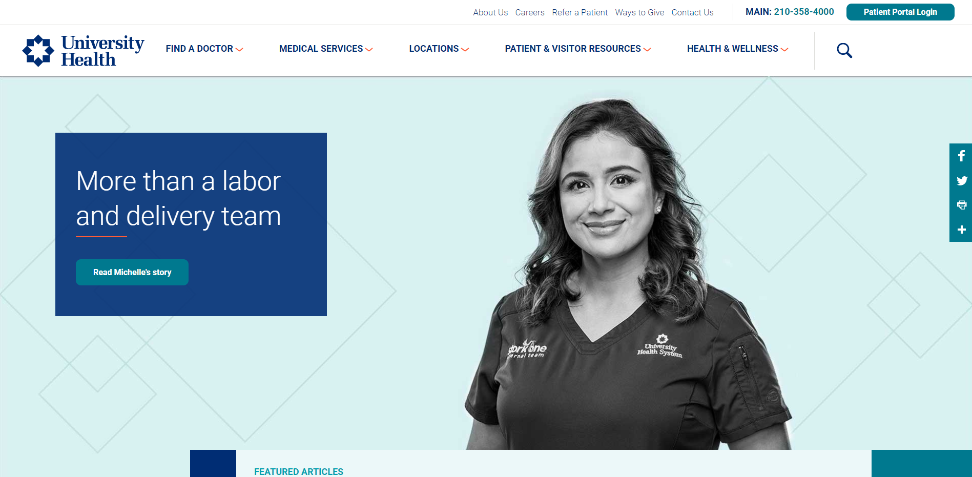
The new, tested design utilizes screen real-estate with full-width custom photography provided by University Health. The design also works to visually break up content and call-to-action in clear ways, with eye-catching elements such as a short orange underline for emphasis and visual separation from the body content. The entire site projects a warm and welcoming appearance while maintaining consistency with the University Health brand.
The redesigned homepage is flexible, giving University Health the space to promote high priority services, integrate blog content, align hero images to match marketing campaigns, and an area to highlight campus expansion efforts.
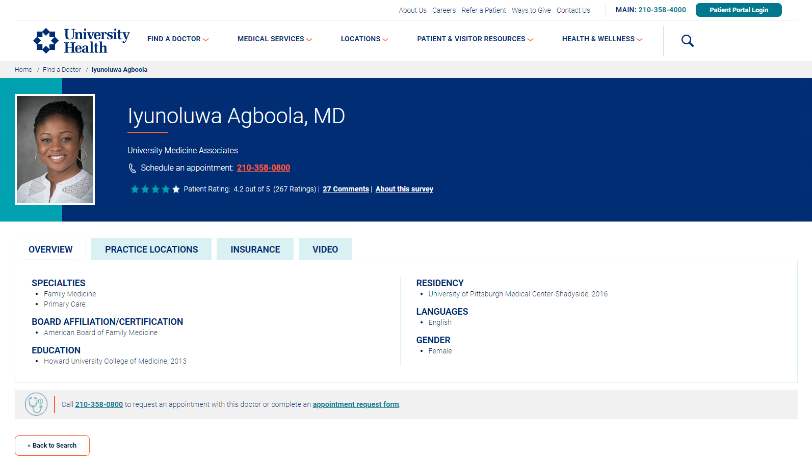
A new provider section boasts expanded search functions to help users find a provider within University Health and a comprehensive provider profile design with integrated patient reviews, videos, locations, and insurance information.
Creating personalized experiences with personas
Taking full advantage of Sitecore’s personalization capabilities, University Health and Geonetric dug into consumer research and web analytics to create six personas for the system. The personas focus on the core service lines of primary care, diabetes, heart, cancer, pregnancy and birth, and transplant.
The personas act as a guide for the University Health marketing team as they create compelling service line and health and wellness content and campaigns. They layout in an easy to read format:
- Demographics
- Technology and media habits
- Top health goals
- Common thoughts and feelings about healthcare
- Top pain points and value propositions
- Tangible ways University Health can assist each audience digitally
Nurturing digital brand awareness and trust
Implementing a new, integrated content marketing hub helps enhance University Health’s brand awareness. Consistent, compelling, and timely consumer-focused wellness content, creates trust and loyalty among target audiences. Improved user experience functions allow users to filter blog content by topics and services and then refine it by expert and service line. University Health can easily swap out featured stories to align with patient journeys or campaigns.

Developing patient-focused content
University Health worked with Geonetric to build out robust, relevant, patient-first content that showcases University Health as a compassionate, expert academic health system. The organization is working to enhance its brand in the community and highlight its alignment with UT Health San Antonio and it’s bring its expertise as an academic teaching hospital to the forefront.
Geonetric’s expert writing team highlights these competitive differentiators in new, user-focused content on the site. The team:
- Developed 78 pages of content for four service lines including, Diabetes and Endocrinology, Pregnancy and Childbirth, Transplant Care, and Women’s Health.
- Created content for University Children’s Health pediatric transplant program and pediatric cancer services.
- Restructured and wrote new content to bring the Transplant microsite into the new University Health website. This section is a comprehensive, 40-page section about transplant care that includes calls-to-action, content, video, and the ability to dynamically pull blogs, news, doctors and locations into the service line pages.
Due to the success of the content development work, University Health is partnering with Geonetric again to write pediatric service line content.
Delivering immediate results
The new University Health site went live late May 2021, and is already seeing positive results, including:
- 11% increase in service line pageviews
- 29% increase in clicks on navigation elements
- 51% increase in clicks on the main navigation
- 19% increase in provider profile organic entrances
- 9% increase in phone calls (clicks on phone numbers) from a provider profile pages
- 7% increase in the average time users spent on provider profiles
Academic Medical Center Leverages Sitecore Upgrade to Launch Digital Presence that Improves User Experience
