“Before the new site, PIH Health’s doctors admitted being embarrassed about the website. They didn’t give patients or potential patients the site address or ever point anyone to their profiles. Now the doctors are thrilled with the design and engaged with using their online profiles to promote themselves. Happy physicians and happy site visitors make for a happy marketing department!”
Terri Skitch, Digital Media Marketing Manager
PIH Health
For most health systems, traffic to the website from mobile users is skyrocketing. Whittier, CA-based PIH Health is no different. In fact, 62% of all web traffic to the integrated delivery system comes from mobile. And the top visited section by mobile users? Find a Doctor.
That’s why PIH Health decided to revamp its provider directory. The organization wanted to ensure its most popular section presented well on mobile devices, engaged mobile users, and made it easy for all users to convert.
Building Impressive Profiles
Since PIH Health had recently undergone a merger and consolidated with a physician group, the organization now had more than 150 primary care physicians to promote. As they worked with their agency, Geonetric, to build a new provider directory, they also took the opportunity to update the provider profiles.
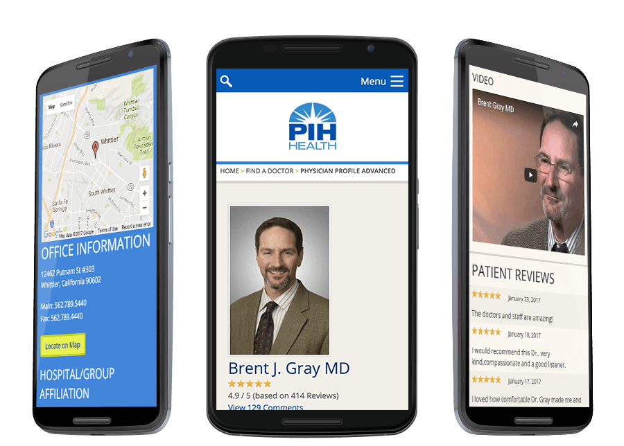
When writing the doctor bios, PIH Health kept the read in mind at all time. Health consumers do a lot of online research and want to learn about their potential physician’s education, specialties, and certifications. However, reading about a doctor’s family and hobbies can also influence selection. Knowing this, PIH Health created biographies that highlight clinical expertise and offers information that helps readers get a sense of the doctor’s personality. To humanize their doctors even more, PIH Health also invested in provider videos. Site visitors can now watch a doctor describe their practice philosophy.
Going Responsive
One of the main goals of PIH Health’s redesign was to go responsive and ensure the website and provider directory automatically adjusted to a wide range of devices. After researching their mobile users, they opted against placing an appointment request form on their provider profiles and instead placed a large phone number at the top. PIH Health knew their target audience found filling out forms on their phones cumbersome, so the phone number worked best.
PIH Health also took a mobile-first approach to profile layout. Using design elements, the profile is broken into sections, keeping important conversion information at the top, while providing new and different value as the user moves down the page. This layout also encourages mobile users to swipe and scroll to learn more.
Mobile users are engaging with the changes. Since launching the redesigned provider profiles, PIH Health has seen an 182% increase in physician profile page views. The Find a Doctor section of the website continues to be the most popular with the mobile audience and has brought in more than 30,000 page views in the first six months since launch. In addition, the doctor videos average more than 1,100 views per month.
Provider Profiles that Engage Mobile Audiences

