“I was really pleased that Geonetric met our ambitious timetable. I thought the whole process was remarkably smooth. The design, VitalSite CMS platform, and content strategy all work together well to make our intranet a go-to employee destination. Geonetric was an excellent partner on our intranet redesign.”
Patrick Moody, Director of Marketing
Henry Mayo Newhall Hospital
When the Henry Mayo Newhall Hospital intranet—or HenryNET—management turned over from the I.T. team to the marketing team, it was clear that changes were necessary.
Initiating Change
An unintuitive navigation, broken links, and outdated content drove the need to develop a responsive and mobile-friendly intranet that could engage their employees and streamline processes.
The marketing team decided to configure HenryNET as a communication hub to cut back on manual email blasts and reliance on the shared drive. But they didn’t stop there.
They also wanted to get departments involved in owning and managing their own content. And, they wanted to implement a better overall experience optimized for what employees need most.
To make all of these goals a reality, they enlisted Geonetric and our VitalSite content management system.
Engaging Employees as Stakeholders
Before rebuilding HenryNET, Patrick Moody, director of marketing and public relations at Henry Mayo, decided to ask their target audience (physicians, medical staff and employees) how they use the intranet today.
They used a survey to all employees as a starting point. With more than 300 responses, Patrick and his team could make well-informed, audience-requested decisions that would improve the overall user experience. They asked questions like:
- Why do you visit HenryNET?
- What tasks do you perform most often on HenryNET?
- What do you like or dislike about using the intranet today?
The variety of answers helped shape priority navigation and content needs. It also helped set design standards for the homepage.
Conversion-inspiring Responsive Design
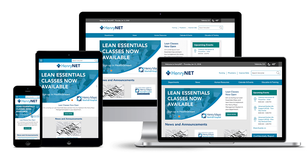
Many employees noted that the design on the old HenryNET felt stale and cluttered. Outdated graphics and “under construction” messages were taking up space and delivering little value. Likewise, the site wasn’t responsive and made it nearly impossible to use on mobile devices in the hospital.
Geonetric used the survey responses to create a streamlined, clean homepage that provided flexible content blocks, promotional banners, and quick access to the links most used by employees. A new site navigation prioritized the places employees say they visit most – Departments, Human Resources, and Education & Training. A new-and-improved quicklinks menu on the homepage prioritized top-trafficked tools and resources employees use most.
Another important feature is the site’s new search functionality. Employees made it clear in the sure survey site search was an important feature that was missing on the last site.
VitalSite’s modules, like News and Calendar & Events, gave the marketing team new opportunities to share content and cut down on the overwhelming email blasts. To encourage employee interaction, they also introduced features like Ask the CEO, featuring Henry Mayo CEO Roger Seaver.
The Henry Mayo Newhall team also took the opportunity during the redesign to brand HenryNET, giving the intranet its own logo.
A Team Approach to Content Governance
Since Patrick and his team didn’t have the bandwidth to be responsible for every department’s content, they got other groups involved early, even including them in the training offered by Geonetric. Departments that previously had little or no content were even encouraged to consider what they’d like on the new intranet, giving them more pride and ownership to the new content and intranet.
Once HenryNET was in a good place, the marketing team did a soft internal launch 20 weeks after the project kickoff. The soft launch allowed key stakeholders to provide feedback before the official launch in November 2017.
Improved Experience: Positive Results
While the previous HenryNET didn’t have tracking like Google Analytics, the new HenryNET does, allowing the marketing team to see what content is driving interest from their employees and staff.
Today, their users are more engaged and enjoying new functionality and directories that weren’t there before, like the internal site search, Recent News, and Calendar of Events. The quicklinks menu on the homepage is one of the most easy-to-access and popular features on the hompage.
The department directory is one of the most popular destinations, with users easily accessing an A-Z list of hospital departments, contact information, and content pages. And more than 77 percent of their users are returning regularly, with users spending just under five minutes per session, on average.
Streamlined Hospital Intranet Design Boosts Employee Engagement


