Design plays a critical role in the way we, as consumers, interact with brands and go about our daily routines. And in today’s digital age, there are few places where design is more prominent and impactful than website design.
As trends come and go — think back to minimalism, flat design, oversized typography, etc. — they shake up not just the way websites look, but the way users interact with them. Designers utilize trends to create visual hierarchy and depth within a website, guiding where users look and how they act without them even realizing it.
In the world of healthcare website design, recent design trends reflect aesthetic changes as well as technological advancements that prioritize user needs, accessibility, and personalization. Geonetric Design Director Christina Hoge shared more about these design trends in our recent “Beyond the Horizon: Digital Healthcare Marketing Trends Shaping the Future” webinar.
From glassmorphism to micro-interactions, the future of web design enhances the user experience in subtle yet powerful ways. Here’s a look at the top trends influencing healthcare website design and UX today:
1. Glassmorphism
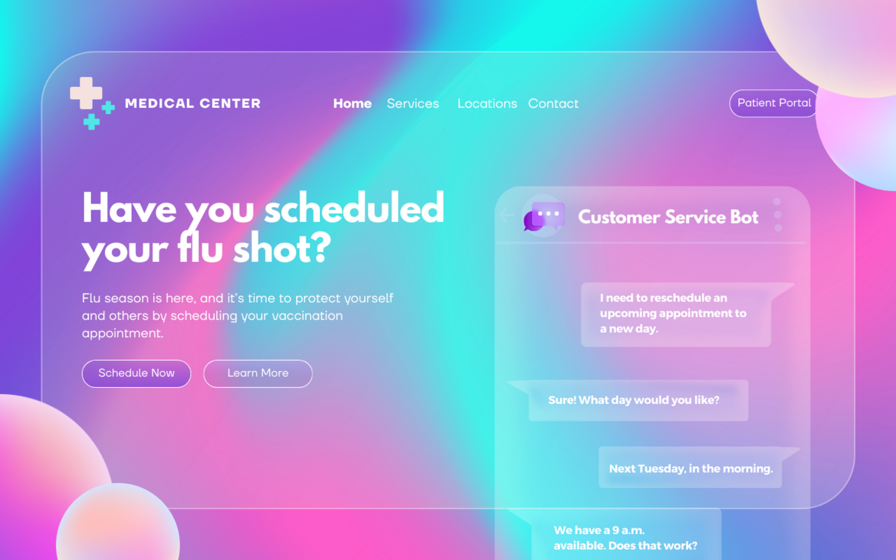
One design trend we’ve seen gain momentum in recent years is glassmorphism, a visual effect that mimics frosted glass through semi-transparency and blur.
This technique creates depth and draws attention to specific elements on the page by organizing content in layers, helping establish visual hierarchy. When used thoughtfully, glassmorphism can provide a polished, modern look to healthcare websites.
2. Microinteractions
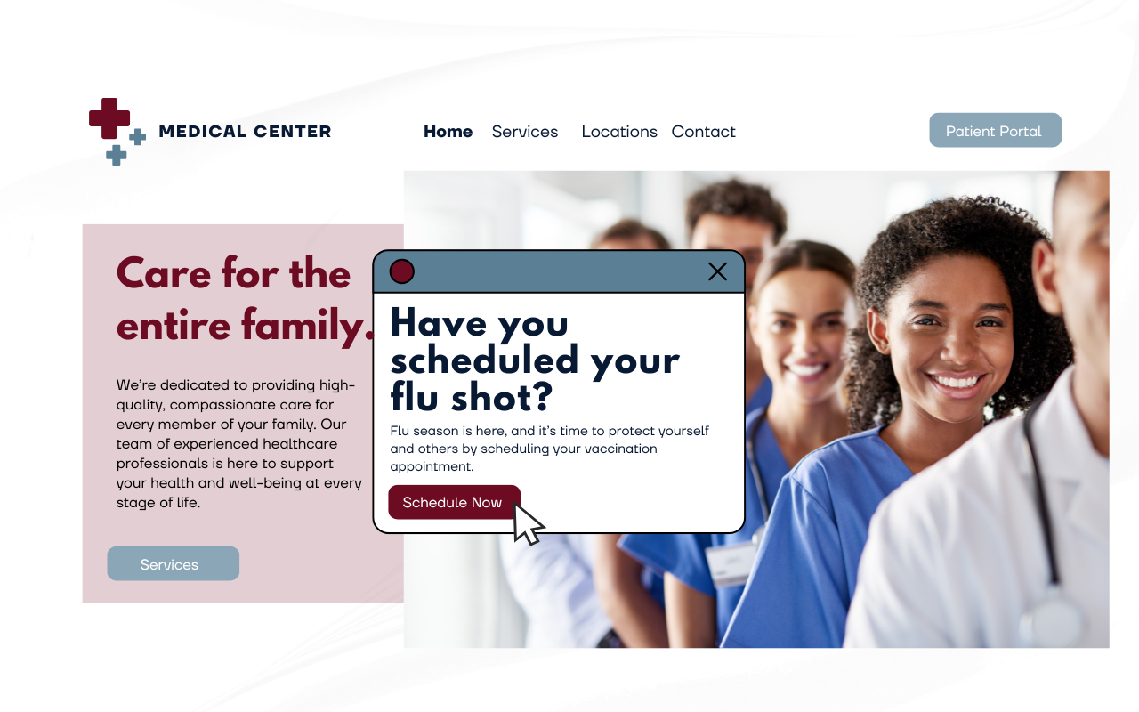
Microinteractions — those small, subtle animations that provide instant feedback — are becoming more prevalent in healthcare website design. Think of a button that changes color when clicked or a notification to schedule an appointment that pops up when a user enters a page.
These small touches improve responsiveness and enhance engagement, making users feel in control. When used correctly, microinteractions add personality and can guide your patients intuitively through their digital journey while helping them feel more in control of how they interact with your website.
3. Dark mode
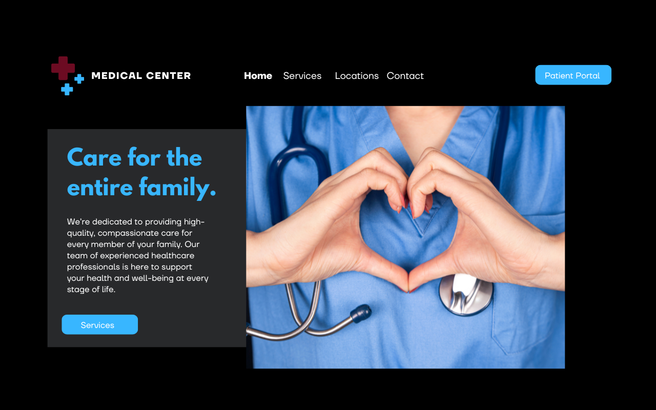
Dark mode is now offered on many websites, apps, and operating systems, allowing users to switch between light and dark themes. Beyond aesthetics, dark mode can reduce eye strain, conserve battery life (especially on mobile devices), and make long-form content more comfortable to read.
By offering users control over their visual preferences, dark mode can enhance usability and improve accessibility for individuals with visual impairments, which is especially relevant for healthcare providers.
4. AI and personalization
AI has started impacting almost every facet of digital healthcare marketing in recent years, and website design is no exception. AI-driven personalization is shaping the way users interact with websites by suggesting content, recommending products, and adjusting website design elements to match individual preferences.
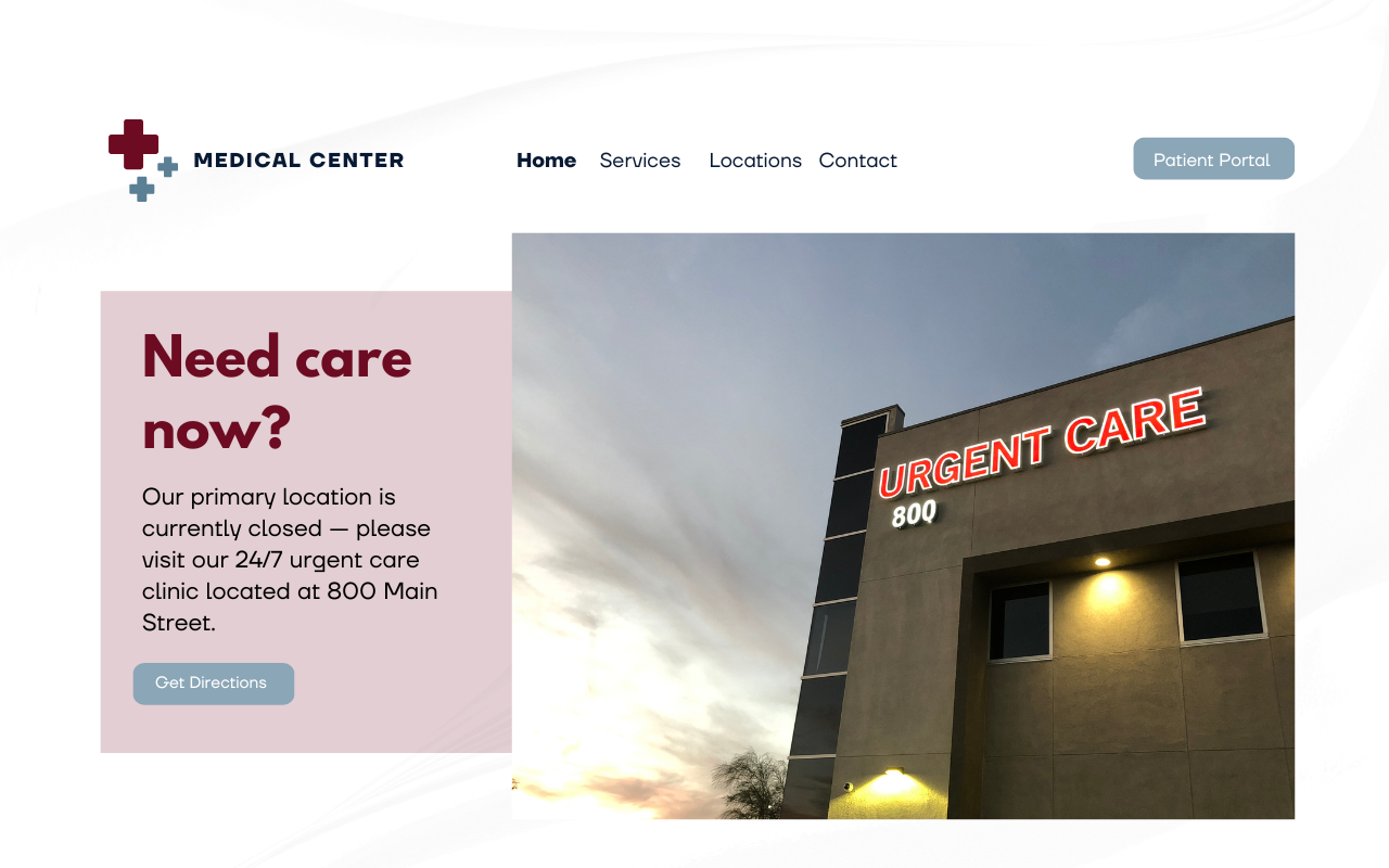
Personalization can be used to update design elements based on the time of day, users’ location, or even their past interactions with your website. This could include changing website backgrounds based on whether it’s day or night or replacing a banner image with one that includes care options after regular business hours — the sky is the limit to how you can pair AI-driven personalization and design to provide more relevant content and improve the overall user experience.
5. Inclusive and accessible design
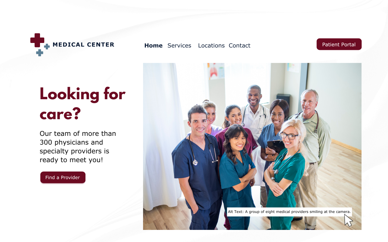
Inclusive design is no longer optional; it’s essential. With a focus on accessibility, websites are increasingly designed to meet the Web Content Accessibility Guidelines (WCAG), ensuring that they are usable by people with a wide range of abilities and disabilities.
Inclusive design can include everything from text alternatives for images to keyboard-friendly navigation that makes finding information more accessible. Inclusive design not only supports the content needs of a broader audience but can also protect your organization from potential legal risks.
6. Responsive and adaptive design
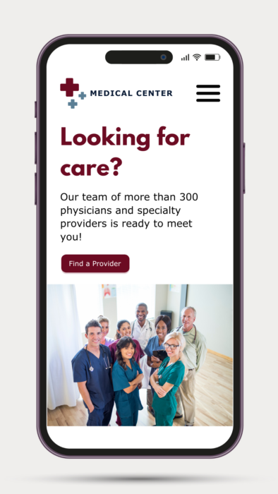
While responsive and adaptive design may not be new concepts, they remain critical in healthcare website design. As patients (especially younger ones [link to Gen Z blog once live]) increasingly access websites on mobile devices — smartphones, tablets, and wearables — ensuring a seamless experience across all platforms is essential.
Responsive design allows a site to adjust automatically to the user’s screen size, while adaptive design offers tailored layouts for specific devices, contributing to a more user-friendly experience.
7. User experience research
User experience research is the foundation of effective UX design and staying ahead of design trends. By gathering insights into user behaviors, needs, and preferences, designers can make informed decisions that lead to more successful outcomes from the start.
In healthcare, user research enables designers to learn what features patients want when they visit a website and the steps they can take to create meaningful, user-centric experiences.
Design trends today go far beyond mere aesthetics. They are driven by advancements in technology, user preferences, and a deeper understanding of accessibility and personalization for healthcare consumers. By focusing on creating engaging, inclusive, and adaptive user experiences, your organization can create a website that looks great and resonates with users, assisting them on their care journey and building their relationship with your brand.
As technology evolves, so will design trends. Yet the ultimate goal remains the same: improve the user experience by putting the needs of your patients first.
Check out the recording of “Beyond the Horizon: Digital Healthcare Marketing Trends Shaping the Future” to learn more about these design trends in healthcare, then contact our team today to learn how you can incorporate them on your organization’s website!

