Getting Started with Digital Governance

Governance gives you a coherent, documented framework that increases productivity by avoiding miscommunication and uncertainty. This guide provides a great place to start down the path to governance, and will:

  • Explain the four main components of digital governance—people, process, documentation, and training—and how to establish decision-making authority in those key areas
  • Provide list of questions that will help you begin to establish a governance framework at your healthcare organization
  • Outline how to get started, wherever you’re at the in process


Download our White Paper


The Importance of Digital Governance

In this video, Jill Jensen explains why digital governance is the foundation of a successful online presence.

Watch this video and learn why it’s important to:

  • Fit all of your online and offline tactics into one cohesive system
  • Use governance to prioritize requests from constituents
  • Ask tough questions to ensure you are serving the needs of your organization and your users
  • And more

Google’s Mobile-First Index Explained

In this video, Joanna Basile explains why Google is making this split and what it means to healthcare marketers.

Watch this video and learn:

  • What you need to do today to prepare for this change
  • What this means for content that you have in tabs and accordions
  • How to use enhancements to keep ranking in organic search
  • And more

The Importance of a Core Strategy Statement to Digital Governance

Governance is another word for organizing and managing both strategic and tactical components that help deliver the comprehensive experience your customers expect—online and offline. And it’s the framework for helping your team keep track of all the moving parts.

Before you set out to create a governance framework, it’s helpful to first have a solid understanding of your organizational goals and create a core strategy statement.

Create a core strategy statement

Once you feel comfortable with your overarching priorities, create a core strategy statement that can guide your team through ongoing website development and maintenance.

Sample Core Strategy Statement

Benefit Health System’s Core Strategy Statement

To support Benefit Health System’s goal of creating an exceptional user experience for our current and prospective patients, families, caregivers, and loved ones, our website will offer an accessible, easy-to-use, and appealing system to help people find our services and take action to get the help they need.

We’ll do this by focusing on users in an expandable website that prioritizes services over organizational issues, answers typical questions in engaging ways, connects services with providers and locations, and makes it easy for people to get the care they need as quickly as possible.

This type of clear statement helps everyone in your organization understand the purpose of the website, which means they’re better able to help YOU create and maintain the site because—even before they make requests—they’ll consider if their request is essential and if it supports the mission of the site.

Use the core strategy statement to make decisions

The strategy statement helps with governance by identifying key components, shown in bold in the sample above.

  • Create an exceptional user experience …
  • Offer accessible, easy-to-use, and appealing options …
  • Find services and take action …
  • Make sure the site can expand, which means navigation paths don’t lead to dead-ends…
  • And so on…

Then, turn your core strategy elements into questions. This makes it easier to evaluate requests for additions or changes to your website by asking: “Does this request allow us to:

  • Create an exceptional user experience?
  • Help people find our services?
  • Focus on users?
  • Build an expandable website?
  • Answer typical questions in engaging ways?”

If you receive a request to add content and the answer to most or all of the questions is yes, the next step is to respond favorably and move forward.

If some or all of the answers are negative, the next step is probably to reject the request. But that’s an opportunity to keep the communication lines open and show how the current site actually meets the requested need—or continue the conversation to find alternatives that do meet your established core strategy elements.

Stay on-strategy

Creating a strategy statement not only ensures all stakeholders are on the same page, it also helps you stay on-strategy when requests come in. It’s not always easy to put your strategy into words or gain consensus across stakeholder groups. But creating the core strategy statement is one of the most important things you can do to ensure your website remains consistent, valuable, and representative of your organization’s mission.

Learn more about core strategy statements and digital governance by watching our webinar, The Importance of Digital Governance.

Content Marketing for Healthcare

Leading healthcare organizations are rethinking their content marketing strategies. To stand out today, you need to create content that is exclusive, valuable, and delivered consistently. Watch this video to learn how to develop a content marketing framework that attracts a clearly-defined audience and drives action. We’ll discuss the basics of content marketing, showcase great examples from inside and outside of healthcare, and highlight how to use content marketing to meet both your organizational goals and your audiences’ interests.

You’ll learn:

  • The many shapes content marketing can take and what makes content valuable
  • Which content marketing tactics healthcare marketers find most effective – and how that compares with the B2C industry
  • Examples of effective (and not effective!) content marketing
  • How to generate ideas for your content marketing efforts
  • And more

Using Measurement Tools to Improve Website Engagement

In this session recorded at Geonetric Symposium, our client-only conference, Lindsey Steinkamp shared with attendees a number of ways to better understand how people are using their sites and where they might be running into problems.

You will learn:

  • Why user experience is so critical for your website (in case you weren’t already convinced)
  • How to use four data-driven (and mostly free!) tools to get a glimpse into how users are interacting with your site
  • How analyzing user interaction with site navigation helped one health system create a more effective redesign
  • Where to begin if you’re just getting started


Gearing Up for a Great Vendor Partnership

At Geonetric, we work with hundreds of healthcare marketers across the country – some have been working with us for over a decade, while others are new clients that came from other vendors.

Some of these new clients may not have had the best relationship with past vendors. Others are just looking for a good working relationship, like Holly Smith, Director of Marketing and Communications at St. Vincent Health in Indiana.

“The decision of picking a CMS vendor can make or break a department. Your working style, the systems you have, and how supportive you are makes our lives easier and that is what we look for when picking a partner and a vendor,” Holly told Geonetric after the launch of her organization’s website.

After working with clients who had some rough history with past vendors, we can see why some might be nervously optimistic as they move into a new relationship. Here are some tips to make the most of your new partnership.

Set expectations – you deserve them!

If your previous vendor took weeks to respond to an issue, or even return a call, ask your new partner what their response time is and set out expectations for a working relationship. A lot of what becomes a problem can be solved up front with communication from both parties being on the same page.

At Geonetric, we’re all about “putting the moose on the table” so you’ll get nothing except a round of applause when you’re honest about how you work, what’s going on in your world and most importantly, your expectations for a smooth-running relationship.

Understand the why: Review notes, materials and presentations

Paper trails are never scoffed when you need them most. If you weren’t involved in the proposal or sales process, ask for notes from the start of the process. Specifically, find out:

  • Why did your executives or decision-makers choose the vendor?
  • What functionality was discussed or agreed upon during the contract process?
  • How will the vendor’s skills or services be utilized for the future work?

If you were present for the sale, keep your notes handy and build on them as the work begins. Referring to your notes and what you’ve heard or understood are important for our next tip.

Chances are, your web vendor and project team is also taking good notes and leaving paper trails, but it never hurts to have two sets of notes to compare and keep each other on the same page.

Be open, honest, and transparent

Relationships of all kinds are a two way street when it comes to communication. Your web vendor can’t read minds, and neither can you.

Goals, ideas, intentions – these are all excellent things to have top of mind when starting a new digital project, but they don’t get very far if they’re not expressed.

If it’s something you want, or something you’ve heard that you need clarified, speak up and be honest. Similarly, if your web vendor doesn’t deliver what you expected, don’t be afraid to respond in earnest. Letting your vendor know what you do or do not like ensures they can adjust deliverables to give you what you expect so you don’t only get the experience you paid for, but the experience you deserve.

Ask questions and expect clarity

The world of digital marketing has a lot of lingo, and sometimes vendors use words differently. “Content strategy” might have meant something different with your last vendor than your new one. “User experience design” can be interpreted in a number of ways.

But whether you’re deciphering vendor lingo, or you’re just not sure about the direction of your project, asking questions and expecting clarity are your rights as a client. This can tie back to the notes you’ve taken, and being open and transparent, but when you’re starting a new vendor relationship, no question is a stupid question. Open-ended questions are a great way to get a thorough answer, such as:

  • Can you explain what you mean by that?
  • Just so I’m clear, you’re saying…?
  • Why are you recommending…?
  • What can we expect with this project/process/step?

If you need more definitive timelines, project management or other support services from your vendor, don’t hesitate to ask.

Good luck on your journey

The fact that you’re already thinking ahead to how this new relationship will work and what lies ahead means you’re on the right track to a successful digital journey. You and your vendor are counting on each other for success, and that’s the bottom line.

Accessibility Guidelines that Healthcare Marketers Overlook

Content Authors: Ongoing Maintenance

Accessibility compliance requires diligence from your content authors as they maintain and update your site. I’ve seen many sites fail to provide adequate alternative text, video captions, and transcripts for audio files. I’ve also seen many sites rely on the use of color alone to differentiate elements.

Text Alternatives for Images – WCAG 2.0 1.1

While many healthcare marketers know that an image needs alt text, deciding on what to put in it gets tricky. Remember that you’re primarily describing the image to someone who cannot see the image as clearly as you can. Image alt text should be an accurate and equivalent representation of the image.

Images generally fit into a few categories:

  • Decoration. The only time an image alt tag can be left empty is when the image is purely decoration or used for visual formatting. Most images used today do not fall into this category as we try to speed up our sites and reduce the number of unnecessary images.
  • Complex. Complex images include graphs, charts, maps, diagrams, and infographics. These images often include a lot of text and information that is more difficult to accurately describe using the alt tag alone. Make sure there is adjacent text on the page that describes what is represented visually.
  • Text. An image that includes text should have alt text that exactly matches the text in the image. There is no need to include the words “logo of” or “image of” as the screen readers already announce the content is an image. When text is included in a large banner image, be mindful of how it will scale. If the same image is used for mobile devices, the text often becomes very small and difficult to read. If someone with low vision zooms in to make the text larger, the scaled image text will become pixelated. WCAG 2.0 1.4.9 Level AAA even recommends no text in images at all except for decoration or logos.
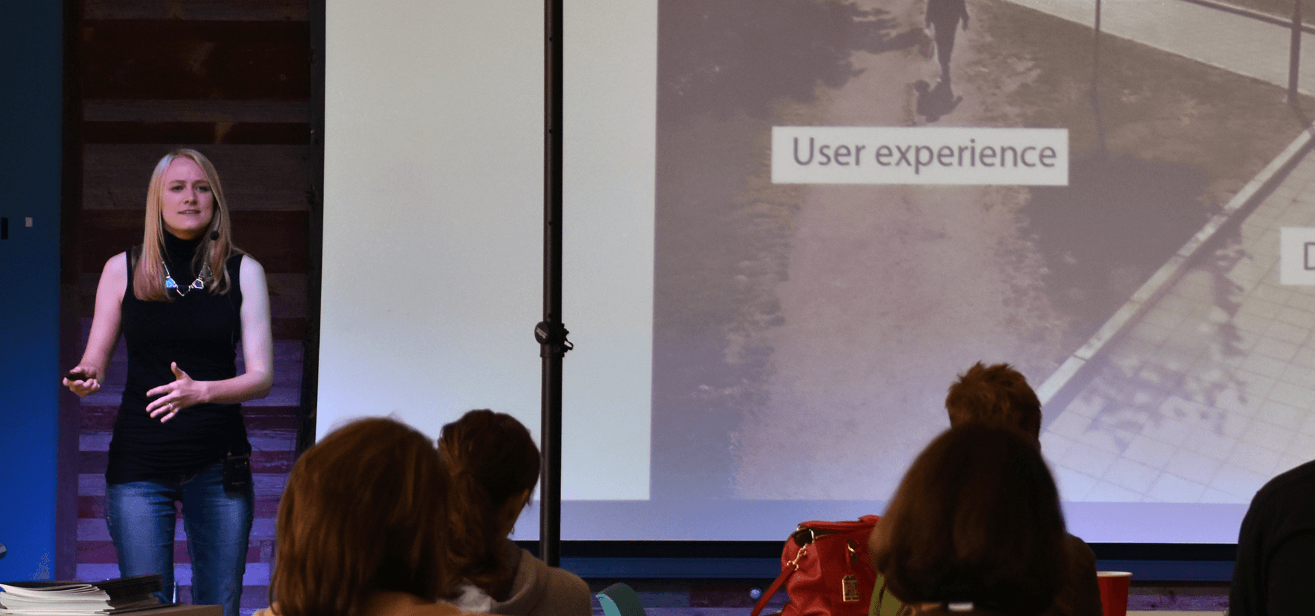
  • Photo. Photos bring color and emotion to a page. They are a point of interest that helps people relate to your content. When someone cannot see the image, or see it very clearly, they appreciate being included in the conversation by having access to descriptive alt text for the photos. Just because a person can’t see that cute baby photo on your maternity page today, doesn’t mean they have never seen a baby in the past. Describe the photo for them, how the baby looks, the expression on their face, their surroundings, and what the baby is doing to paint a picture in their minds. Use tactile descriptions that mention color.

In addition, images that are the only thing inside a link must have alt text that clarifies where the link goes. Without that text, someone using a screen reader will just hear “link,” which gives no information where the link will take them. If you’re still unsure about what to include in the image alt text, refer to the Alt Decision Tree for guidance.

Alternatives for Media – WCAG 2.0 1.2

Like images, all media files need a text alternative. You need transcripts for audio and video, and captions for video that has audio. This is obviously necessary for people who are Deaf or hard of hearing, but really everyone benefits from this often-overlooked accessibility requirement. People with learning disabilities or who have another native language find it helpful, as well as people who are unable to play the audio due to technological or environmental constraints. The text alternatives also provide the only way for search engines to index your media content.

In addition, people who are blind need their videos audio-described so they can follow along with anything that may be happening visually. Audio descriptions are important for videos that show text, non-verbal gestures or cues, and scene changes. Some videos may not have these elements, such as stationary headshot videos for physicians, and therefore do not require an audio description.

PDFs

PDFs are another form of media that are often neglected. PDFs and other external media files you provide must also meet WCAG criteria. This includes things like adding a document title, image alt text, and ensuring proper linear reading order with a screen reader.

Use of Color – WCAG 2.0 1.4.1

If you use color to distinguish elements on a page, the color has to meet a contrast ratio of 3:1 to be compliant. If you’re using colors that don’t meet that ratio, you must use other formatting to distinguish the elements.

For example, you may think the underline beneath links looks dated, but it serves an important role. If you remove the underline, the text color is the only distinguishing factor. That means it must meet the proper ratio against the other text and against your background color.

Meeting ratios for both is difficult. If you don’t like the underline beneath links, try moving the underline lower, making a dashed line, adding a border, or highlighting the link. As long as you visually distinguish the links with some formatting element, you’ll be compliant and make it easier for people with low vision to navigate your site.

For graphs, charts, and image, make sure you’re using more than color to show differences. For example, a line graph with multiple lines of different colors won’t make sense to someone who’s colorblind. Distinguish the lines some other way, such as with symbols. For bar and pie charts, adding texture is effective.

Developers: Implementation & Design

Attention from your content authors is key, but it’s not enough to fully comply. Here are some things designers and developers need to implement.

Moving Banner Sliders and Video Backgrounds – WCAG 2.0 2.2.2

Content sliders and video backgrounds are increasingly popular on healthcare websites. But these common features can make your site unusable for visitors who have motion sickness, low vision, or cognitive impairments.

People with vision impairments or reading disabilities need more time to read and understand content. When content is in slides that are continuously moving with no obvious way to pause them, they will be impossible to read. People with motion sickness or vertigo could even feel ill from the motion, which is the last thing you want to make potential patients feel when coming to your healthcare site.

To help these people, always provide a user control to let them stop or pause any animations to give them the time they need to read the content (see image).

Avera eCARE's home page, which has a video background. A "pause" button is at the bottom right corner of the video.

Keyboard Accessibility – WCAG 2.0 2.1

Everything on your website needs to be accessible by the keyboard. There are many reasons a person may not be able to use a mouse like arthritis, Parkinson’s disease, or any number of other motor skill disabilities. People with blindness that use screen readers also use keyboard only.

Visible Focus – WCAG 2.0 2.4.7

When you use a mouse, you watch the pointer to know where you are on the page. To see where you are with a keyboard, your site needs to provide a clear focus state for clickable elements, such as an outline or highlight (see image).

St. Vincent Healthcare's home page, which uses a box with an orange outline for visible focus. The focus is on the "Choose a Doctor" link in the navigation.

Bypass Blocks – WCAG 2.0 2.4.1

Bypass blocks make navigating a page faster for people that use keyboard only and screen readers by giving them ways to skip over repetitive content blocks like your site header.

One way to provide a bypass block is to include a “skip to content” jump link as the first link on the page. The link should be visible when it receives focus so sighted people using the keyboard will be able to make use of it to bypass the navigation and skip straight to the main content.

Another method is to use semantic HTML5 elements and ARIA landmark roles to separate content into meaningful sections. Screen reader users will be able to use these named sections to skip to the part of the page content they need like the navigation, search, or main content.

Dropdown menus and other hidden content

Some pages include content that’s initially hidden and reveals itself when a visitor clicks a button or hovers over something. Some examples include drop-down menus, photo sliders, accordions, tabs, and light boxes.

Without the proper ARIA roles, screen readers can’t identify what these types of elements are doing. Your code must notify screen readers when hidden content appears to let visitors fully interact with your site.

Best practices and technology have changed in the past couple years, so make sure your site adheres to the latest guidelines. A couple years ago, ARIA had very little browser support. Now it is becoming more popular, changing the standards for creating equal access to site content.

Depending on how old your site is, these changes may warrant a partial or complete redesign.

Conclusion

Full compliance with Section 508 and the ADA requires effort from everyone who contributes to your website. Make sure your designers, developers, and content authors follow the WCAG to keep your site in compliance.

While this post gives an overview of some commonly missed guidelines, achieving full legal compliance requires attention to many more details. You can get a complete picture of your current compliance by talking with an accessibility expert at an agency like Geonetric. Contact us if you’re interested in learning more.

Take Control with Digital Governance

In this video, Jill Jensen explains why digital governance matters to healthcare marketers.

You’ll learn:

  • Four components of governance and how they work together
  • How to improve the governance process you’ve started, or where to start if you haven’t yet
  • The benefits of creating a core strategy statement
  • When to use governance tools – like a content matrix – and why

Website Redesign: How Gundersen Health System Unified Its Digital Brand

With hundreds of locations and multiple microsites, Gundersen Health System was looking to redesign on a content management system (CMS) that would give the growing organization the flexibility and functionality it needed. Attend this webinar and hear from Gundersen Health on how they created a new, responsive main site, complete with provider ratings and reviews, and 11 responsive microsites that complement the overarching system brand – all built on one, flexible CMS.

You will learn:

  • What to look for in a CMS that will support an integrated system (hint: scalability, flexibility, and the ability to control your branding across the system)
  • The benefits of creating a user-focused content strategy that merges multiple sites under one digital brand
  • How to build custom, physician profiles that connect with site visitors and help them convert, complete with ratings and review