4 Ways to Highlight Access to Care on Your Website

Your website is the place where you can showcase all the types of care you offer and strategically guide people to the option that’s best for their symptoms or condition. Choosing the right care setting—whether that’s a primary care clinic, an urgent care center, a virtual visit, or the emergency department—can save patients money and time, and improve their satisfaction with your organization.

1. Use Your Homepage Effectively

If guiding patients to appropriate care settings is a high priority, build a homepage that helps you meet that goal.

Your homepage is probably the most visited page of your site. Focus its valuable “above-the-fold” space on connecting users with the type of care that’s right for them. Use design, functionality, and content to showcase the options your patients have to choose from, and then give them an easy way to learn more.

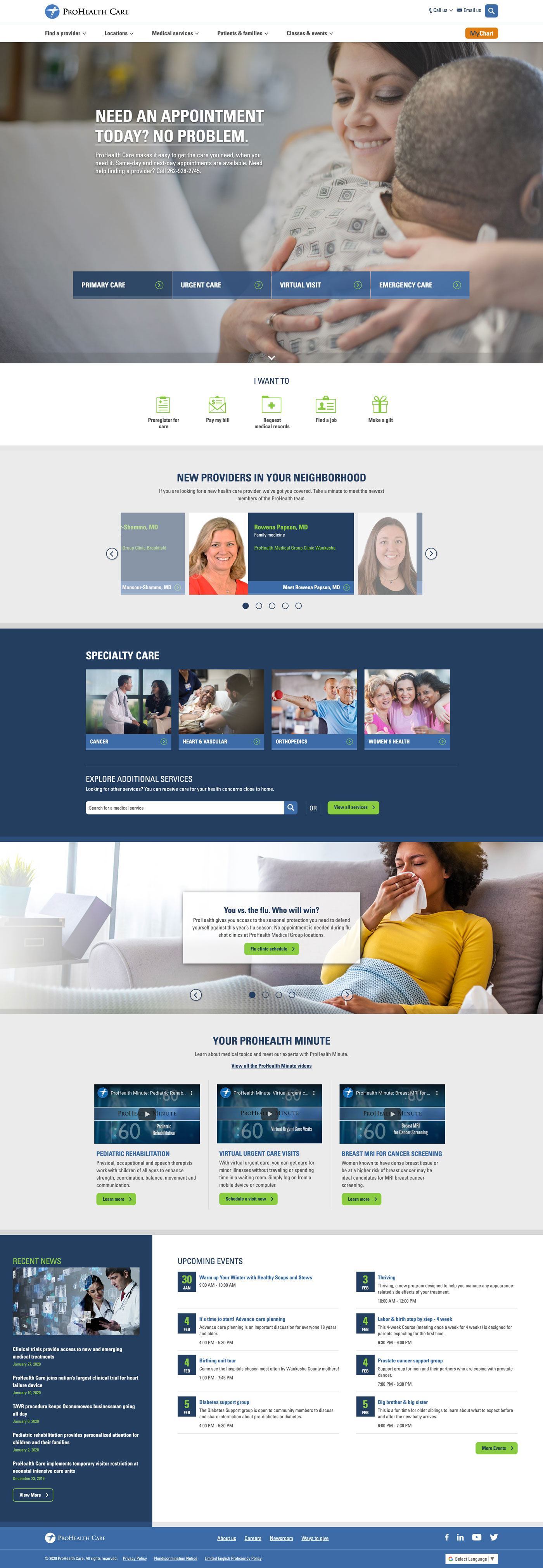
An Example: ProHealth

ProHealth Care’s homepage focuses on helping users learn about same-day and next-day care options. Whether users are on desktop or mobile, choices for quick care are front and center. Once they’re ready to learn more, they can click on the name of the service to see how to take the next step.

screenshot of prohealth care's homepage

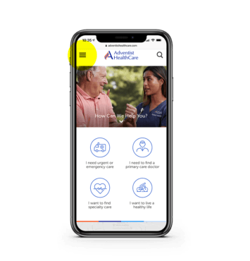
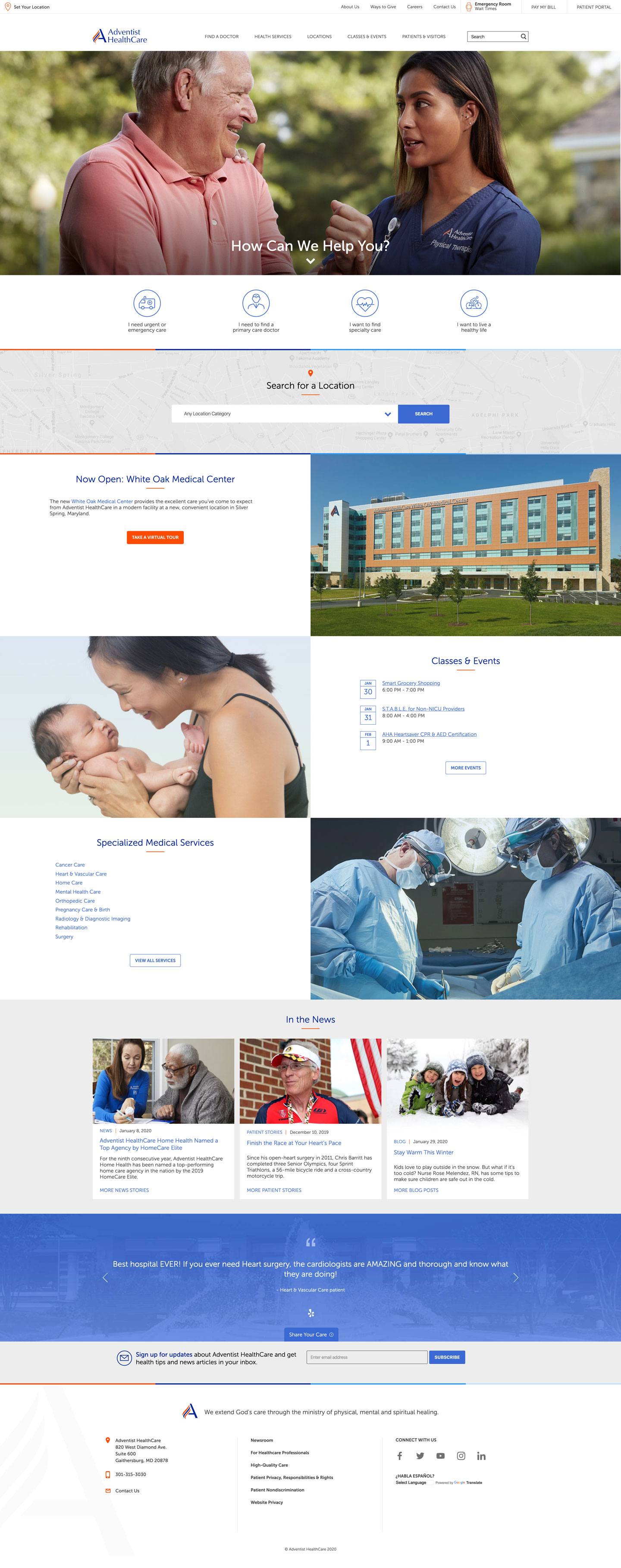
Another Example: Adventist HealthCare

Adventist HealthCare’s home page uses buttons to represent a continuum of care and funnel patients to content about the type of care they need. Depending on where they are in their health care journey, users might opt to learn about living a healthy life, or they may choose to focus on primary, specialty, or urgent or emergency care.


2. Make It Easy to Compare Care Options

Patients don’t always know where to go for care—and they’re looking to you for guidance. It’s essential to present information on your care options in a way that’s easy to understand.

Create a great user experience by using content and design to make it easy for patients to compare their options for quick care when they’re sick.

Show pertinent information about each quick care option – primary care, urgent care, retail clinics, virtual visits, etc. – in one place so users don’t have to hunt for information across your site.

An Example: Rush Copley Medical Center

Rush Copley Medical Center in Aurora, Illinois, found success by creating a “Where to Go for Care” page in their health services section.

Rush Copley uses subheadings to identify and guide readers through their care options. Each care option lists services available and conditions treated to help readers determine the best place for care. The page also features a short video and a PDF users can download and print.

To help readers understand the importance of choosing the right type of care, Rush Copley explains the benefits of how going to the right place of time can save time and money.

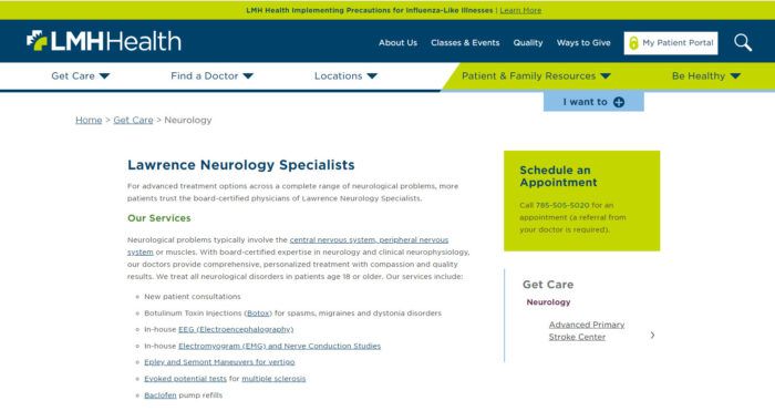
3. Optimize Service Line Content

When you follow web writing best practices, you’ll build service line content that’s appreciated by both users and search engines.

Dive into keyword research to see how consumers in your area talk about each service and what questions they’re asking. Then, develop content that answers these questions and naturally incorporates priority keywords.

Keyword research related to walk-in care often reveals phrases such as “when to go to urgent care”“urgent care near me,” and “paying for urgent care.” Symptoms also are frequently searched.

Help users engage with your service line content by

  • Focusing on your user
  • Keeping content simple and easy to scan
  • Cross-linking to related content, such as location profiles and related service lines
  • Including a strong call to action

An Example: Olmsted Medical Center

Improve user experience by creating actionable content that cross-links to relevant information like Olmstead Medical Center’s convenient care page does. This helps readers easy move through your site and understand the next steps they need to take to receive care.

Grow your monthly pageviews when you follow our web writing tips to develop content for service lines like telemedicine and urgent care.

Olmsted Medical Center made similar updates to their content and are enjoying an impressive year-over-year increase in pageviews, including a 25% increase to their convenient care page.

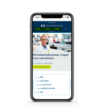
4. Prioritize the Mobile Experience

Cone Health partnered with Geonetric to focus their homepage on the idea of “right care, right place, right time.” It was important to the organization to make sure both desktop and mobile users could easily learn about and connect with a wide range of services. User research helped the team develop a dynamic homepage that’s well-received—and well-used—by patients.


What’s Your Approach?

Need help determining the best approach to helping consumers understand their options for care at your organization? Contact us. Geonetric’s content strategists and writers understand the complexity of health care and know how to write content that users and search engines love.

Strategies for Patient-Centered Content Marketing

The question now is: How do you get the best return on your investment?

Join Geonetric’s healthcare content experts and learn why the strategy behind your content marketing is just as important as the quality of the stories you’re pushing out. Whether you’re new to content marketing, feel like you’re just going through the motions, or struggling to keep up with demand in a meaningful way, you’ll walk away from this webinar ready to invigorate your content marketing and deliver real value.

Learn about ways to:

  • Use personas and patient journey maps to tie content marketing efforts to your audience’s real-life experiences and concerns
  • Apply keyword research to make user-centered decisions about content
  • Build editorial calendars that keep your team on track to create and publish the right mix of content
  • Leverage CRM to gain insight into your audience’s behaviors and meet them where they’re at

Five Web Design Trends Healthcare Marketers Should Focus on in 2020 and Beyond

Five Web Design Trends Worth Your Attention

Trends focused on supporting intuitive experiences, giving users the information they are seeking with ease, are always in style. Savvy organizations are finding new ways to use design to tell their brand stories and better connect with their audiences, uniquely differentiating themselves from their competition.

What does this mean to healthcare marketers and your websites? Today, patients want convenience, exceptional care, and remote access. A first impression online that provides users with a convenient, intuitive, easy access to their top tasks can potentially kick-start a successful patient journey and ongoing, positive relationship. Design, if accompanied by the right content, will help produce this experience.

Here are the top five design trends for 2020 that healthcare marketers should pay attention to and how your organization could benefit from incorporating some of these into your web strategy.

#1: Inclusive design

Accessibility is an important topic in healthcare web design right now. But stepping back and thinking about accessibility as part of the bigger theme of inclusive design is really where your focus should be. Considering the needs of a diverse population provides a better understanding of your audience.

Building inclusive thinking into the design process early will ultimately provide a better user experience for all visitors on your site, as well as save money and time by not having to retrofit your site to meet accessibility standards. For example, consider color contrast, alternative text for images, text resizing capabilities and many other standards to make your site more accessible. Listen to our on-demand webinar on Website Accessibility and Healthcare to learn more.

#2: Minimalism

Minimalism isn’t a new concept. It’s about expressing only the most essential and necessary elements in a design. This translates into website designs that use space intentionally between elements as to not overload the user, displaying the information users are truly seeking, and making their click path more easily identifiable.

Minimalism is just as much about the functionality as we see more experiences allowing for one-tap registration and instant payment. This comes to mind when thinking about a patient’s click path for actions such as scheduling an appointment, finding a doctor, registering for an event or making an online bill payment. Using minimalism effectively can lead the user through the page by organizing the content and providing balance among the other design elements.

#3: Purposeful micro-interactions

Micro-interactions are small design elements with a single purpose that create engaging, welcoming and human moments for users while interacting with your site. These elements tend to communicate status and provide feedback, helping users see the results of their actions. Popular micro-interactions include simple animations, swipe actions, animated buttons, and call to actions that have a bit of action associated with them, nudging the user to interact.

Micro-interactions can strengthen a brand’s representation based on its active visual and motion design, creating an attached emotion for the user. Visitors can customize their experience based on how they choose to interact with the site. It is important to know your users well in order to serve them effectively with interactions that enhance their overall experience and not take away from it.

#4: Tailored experiences

New devices are inevitable as technology continues to advance and design will continue to adapt as necessary along with it. Web design will have new opportunities to create unique, relevant experiences for users, such as with foldable, touchable displays, voice user interfaces, and personalization based on collected data.

Traditional care is shifting along with technology and with more patients utilizing the convenience of telehealth and other remote healthcare resources, organizations will need to rethink how to best design and create experiences to meet their patients’ needs.

#5: Custom, brand-driven elements

Some of the more visually focused design trends are including dark layouts, diverse typography, and custom illustrations. Dark mode, or using light-colored text, icons, and graphical user interface elements on a darker background, is becoming a popular option, especially as trend-setters Apple and Slack have been embracing it. Dark mode can provide a more enjoyable user experience, drawing the content out and creating a sleek, bezel-less display or illusion on mobile that your website’s design goes from one edge to the other.

Designs are also experimenting more with typography after many years of bold, lowercase sans-serif typefaces. Typography is seeing a bit of rejuvenation with artistic executions and unlikely combinations. Additionally, purposeful, custom illustrations and brand elements are on the rise, translating information to incite emotion to take action and strengthening the brand identity.

Create a great design experience

Deciding whether or not to include design trends into your website is dependent on your organization’s and users’ needs. Regardless of what you decide, use design as a tool to produce the positive experience intended for your site’s visitors and effectively tell your brand story.

And remember, if you’re unsure of how to move forward with your web and design strategy, call in the experts. And, be sure to check out our Digital Marketing Trends to Watch in 2020 webinar for more discussion on healthcare marketing and web design trends.

What Healthcare Marketers Need to Know about Price Transparency Changes

“We believe the American people have a right to know the price of services before they go to visit the doctor.” – President Donald Trump

In January 2019, CMS rules requiring hospitals to share a file with chargemaster data for their services went into effect. This data is, at best, useless to consumers and, at worst, harmful as consumers may make important care decisions based on vastly overestimated or underestimated costs.

This was always framed by the administration as only the first step in its push for healthcare price transparency, so it should come as no surprise that an additional set of rules was finalized in the fall which goes into effect January 1, 2021.

Before we dive into what these new rules say, it’s important to note that there have already been legal challenges to the price transparency rule and it is likely there will be changes implemented before it goes into effect.

As of today, there are actually two new rules coming into play – one rule for hospitals and another for health plans.

Requirements for hospitals

Here are the highlights of the plan for hospitals:

  • Expand the “Standard charges for items and services” file from the existing rules. Remember the machine-readable file of “standard charges” that you posted in January? This rule maintains that file but expands the definition of “standard charges” to include:
    • Gross charges (as found in the hospital’s chargemaster)
    • Payer-specific negotiated charges
    • Discounted cash prices
    • De-identified minimum and maximum negotiated charges

  • In addition to the expanded definition of “standard charges”, CMS has created some other definitions to clarify some elements of the transparency rules:
    • Hospital – An institution that is licensed as a hospital by the state or locality. This means these rules apply to specialty hospitals such as cancer hospitals or children’s’ hospitals but not federally owned or operated facilities such as those run by Indian Health Services, VA hospitals, or Department of Defense facilities (these facilities also don’t negotiate prices.)
    • Items and services – “All items and services (including individual items and services and service packages) provided by a hospital to a patient in connection with an inpatient admission or an outpatient department visit for which the hospital has established a charge.”

      Basically, the list of “standard charges” must include all of the pieces for which the hospital has established charges, but not the pieces which it does not control such as third-party ambulance services or non-employed providers.

  • Provide a consumer-friendly online presentation for at least 300 shoppable services. CMS defines shoppable services as “a service that can be scheduled by a health care consumer in advance, and has further explained that shoppable services are typically those that are routinely provided in non-urgent situations that do not require immediate action or attention to the patient, thus allowing patients to price shop and schedule such services at times that are convenient for them.” For each service, the following data should be available:
    • Payer-specific negotiated charges
    • Discounted cash prices
    • De-identified minimum negotiated charges
    • De-identified maximum negotiated charges
    • 70 of the shoppable services are dictated by CMS. The remainder is selected by the hospital. If the hospital provides less than 300 shoppable services, then list all appropriate services that they do provide. If the hospital doesn’t offer all of the CMS selected services, then add more hospital selected options to get as close to 300 as possible.

Unlike the previous rule, CMS has added the additional requirements that these files and tools are displayed prominently, are easily accessible, and are presented without barriers such as paywalls or registrations.

The new rule also adds a mechanism for monitoring and enforcement. While monitoring will follow complaints to CMS, there is now a penalty for failing to publish this information with fines as high as $300 per day.

Requirements for health plans

A second proposed rule also adds price transparency for health plans, the highlights include:

  • Health plans must disclose negotiated rates for in-network providers and allowed amounts paid for out of network providers on a public website
  • In addition, health plans will need to offer a transparency tool to provide members with personalized out-of-pocket cost information for all covered services in advance. “This requirement would empower consumers to shop and compare costs between specific providers before receiving care…” according to CMS.

Compliance is only a beginning – using price strategically

The first piece of this puzzle is being in compliance, that’s only a minimum bar for what your organization can and should do through this process.

The esoteric and highly variable nature of reimbursements for healthcare services has taken away one of the key tools of marketers and strategists within our industry. Remember back to Marketing 101 – what’s the last of the 4 Ps of marketing? Price!

Understanding your organization’s prices and sharing that information with consumers may be a little scary, but it opens the potential for you to begin using pricing strategically.

This begins by rationalizing prices for services within your healthcare enterprise. As you get the information assembled to meet the new compliance requirements, you’re likely to find that the same services have very different costs from location to location. These variations have been the norm in healthcare but can you justify the variation in a consumer’s out of pocket costs when that information is publicly available?

Your organization will need to take the time to sort through its pricing information to ask, possibly for the first time, what the costs for a service really ought to be and, if those costs will vary for site to site, how will that be explained or justified?

From there, we now have the opportunity to think about how price can be used to influence consumer behavior. Do we bundle a set of services together to give consumers greater predictability? Do we offer discounts or waive deductibles to steer patients to underutilized surgical suite times or less busy outpatient surgery locations? Price transparency opens the door to increase your competitiveness in ways that weren’t previously possible.

Does this accomplish what health consumers really need?

As an industry, we’ve been pushing our patients to act like health consumers. Co-pays and deductibles have soared in an attempt to force health consumers to be more active in healthcare decision making. Consumers have responded and, after years of talking about the rise of health consumerism, are now directing billions of healthcare dollars.

The challenge that we face now is that consumers are often poorly equipped to make these important decisions. Information on the price of services is an important piece of the puzzle but, ultimately, if we only give consumers information on the price of services, they’ll make decisions based only on price. Which doesn’t necessarily benefit the patient or the organization.

I’ve long viewed transparency in healthcare as a three-legged stool – price, quality, and experience. This is the next stage or price rationalization.

  • Are you pricing services appropriately given your quality metrics relative to competitors?
  • Is the experience that you deliver for your patients up to snuff given your price?
  • What changes do you make if your three-legged stool is out of balance?

Healthcare has made great strides over the years in quality transparency through the publication of a variety of quality metrics and reports as well as in the area of experiential transparency in the publication of patient satisfaction survey information such as HCAHPS and CG-CAHPS.

What health consumers need is all of this data pulled together to support the care decisions that they need to make. Need a knee replacement? Wouldn’t it be great to understand the quality, price, and experience tradeoffs of one doctor or surgical center versus another? Maybe you’re willing to pay more to be pampered? On the other hand, maybe you’re willing to deal with an unpleasant doctor if the price is right?

But for that core question – does this give consumers what they need for price transparency? The answer is still no. This is a big step forward albeit one that’s likely to change and evolve before going into force next year. At the end of the day, this step on the road to price transparency still fails to get to what consumers really want – their expected out of pocket costs.

Additional resources on price transparency rules:

Combine Your Website Content and Health Library for Maximum Results

It’s typical for hospitals and healthcare systems to invest in a digital patient education system, or syndicated health library on a website. A health library provides clinically reviewed patient education from a trustworthy source to your site visitors. It can help your patients understand health topics and take part in their care for better outcomes. Health library content is not brand-specific content developed by your internal writing team, but it can work successfully with your content.

Value of a Health Library

Use your health library to educate patients whenever they engage with your organization. Your health library can serve as:

  • Personalized education during a patient’s appointment
  • Access to health information during a patient portal visit
  • Research and education resource during a website session

Website Approach

Effective integration of a health library can add significant value to your website and give your organization a competitive advantage by:

  • Attracting new patients
  • Boosting your brand’s trustworthiness
  • Building patient loyalty and retention
  • Delivering evidence-based health content
  • Influencing health and wellness, behavior change, and condition management (population health management)

One of the keys to gaining value from your health library content is to make it a natural part of the patient journey. Connect it to the rest of your website presence rather than siloing it. This critical task may fall to you as a healthcare marketer or digital strategist.

Health Library Engagement

Take on the task of linking your website content with your health library proactively. Launching health library access on your organization’s website and then waiting for visitors to find and use it doesn’t initiate consumer engagement or generate enough traffic to justify the investment.

Promoting awareness of your health library through other channels may increase traffic, but it won’t enhance your user experience and translate into loyalty. After all, internet users can get free, reliable health information from popular sites like WebMD, National Institutes of Health, MedlinePlus, or Mayo Clinic. They don’t have to visit your website to learn about health topics or specific symptoms and conditions.

At this point, you may be wondering:

  • How can we get our money’s worth out of a health library?
  • How can a health library help us answer user questions and build trust with our target audiences?
  • What should we do to make our health library a valued and seamless part of our website?

Follow our strategic approaches to achieve these goals.

Provide Seamless User Experience to Patients

Start by focusing on content, which helps you meet your organization’s goals and website users’ needs at the same time. Develop your content strategy with a seamless patient experience and content integration in mind.

Depending on your health library provider and license, your integration plans could use patient education in the following ways:

  • Link conditions and treatments in page copy (especially on service line pages) to health library topics
  • Enhance your in-house service line content pages by embedding content on the page
  • Serve as your service line content in your branded format (Requires appropriate licensing with your health information vendor)
  • Populate dynamic content (SmartPanels for VitalSite clients) to give users convenient access to:
    • Related health library content to complement your medical services on service line pages
    • Service line providers who specialize in the care and related service line events while viewing health library pages
  • In the form of quizzes, interactive tools, and symptom checkers to evaluate and decide on next steps to seeking care and treatment or living a healthy lifestyle
  • Embed videos or illustrations showing elective or common medical procedures

LMH Health – Lawrence Neurology Specialists Health Library Example
A well thought out strategy helps keep your patients interested and engaged in your content and on your website. Take your content integration plan a step further by customizing specific website copy to align with consumers’ interests in your area or trending news topics.

Content Unification

When your health content focuses on what your website visitors want to know, your organization will benefit from satisfied customers. Your health library will make sure you deliver:

  • Easy to access patient education information
  • Accurate explanations of conditions, treatments, and services
  • Interactive involvement and management of personal health and wellness
  • Reliable, up-to-date health information content

Let Us Help

Contact the Geonetric team if you need help creating a customized health library integration strategy for your hospital website.

5 Ways to Connect With Users in Your Forms

That’s why considering your form’s voice and tone, error messages, security experience, and transparency are so important to the user experience (UX). And that UX carries over into trust and recognition of your brand, driving present and future conversions.

Here are five ways you can connect with users through your forms.

1. Speak their language – plain language, that is

Whether through error messages, labels, or tooltips in your forms, speak the language of your audience. Most of the time, that’s plain language – or writing so your audience can understand it the first time they read it.

Error messages are a great example. There might be a technical reason a form didn’t submit, but does technical jargon have any meaning to someone using your form? Or does it aid them in fixing the problem? Probably not.

When writing form directions, labels, error messages, and tooltips, keep proven web writing best practices in mind – use plain language written at an eighth-grade reading level, give helpful descriptions, and when there is a problem, provide constructive advice so users can them fix it.

2. Keep form fields in a single column

There’s something quite annoying about having to scroll left and right on your mobile device to see the whole of a screen. This happens most with forms that aren’t responsive or have too many columns of fields.

Best practice dictates that a single column form experience is best for keeping information linear. It removes barriers that can cause cognitive load – the psychology phrase used to describe “the amount of working memory resources.” Think of it like your computer running slow because too many applications are open.

Cognitive load has a lot to do with how we use the web and interact with tasks, and the more barriers in our way, the less likely we are to complete something. The same goes for your users.

Single column forms help eliminate that load, focusing the mind on one line, one field, at a time. It also plays nicely with mobile devices and smaller screen sizes.

3. Tell them why you’re asking for information

Forms can already be a chore to fill out, so if you’re asking for information that people aren’t sure they need to give you, the least you can do is explain why.

Information like birthdays, zip codes, and phone numbers may be needed for more detailed forms, but if you’re trying to get someone to sign-up for your email marketing, is it needed?

If you decide that, yes, you need that information, it’s best practice to let the user know why, especially if it’s not immediately clear. An easy-to-reach tooltip – a clickable icon or button that displays helpful text to users – can come in handy. For example, if it’s an email sign-up asking for a user’s birthday, use a tooltip to explain that you’ll customize content and preventative information based on their age.

Likewise, if you don’t have to ask for this information – skip it. It’s best practice to only ask for the information you need, not the nice-to-have information. Asking someone to complete a form is asking for their time and attention, so only require the information that’s most pertinent to their stage of the journey.

4. Highlight each field individually

You probably spend your time online with more than one window open, right? So do your users. That means their attention is divided between your form, a store shopping cart, their grocery list, and any other tasks they’re doing online.

To help them stay focused and complete the form, enable autofocus on your form fields.

What is autofocus? Autofocus uses a different appearance or color to focus the user’s attention on one field at a time, usually the field that’s next on the form. This allows users to pay closer attention to the information you’re asking, rather than feeling like they have to wander their eyes around the screen to see what to do next.

Like single-column forms, autofocused fields lower the chance of cognitive load. They also help users relying on screen readers or assistive tools to navigate the web more easily complete your form.

5. Make sure your form is accessible and inclusive

Accessibility is less about making something accessible to differently-abled bodies, and more about making sure your experience is inclusive to all.

With forms, it’s easy for things to get inaccessible very quickly. So if you want to deliver an inclusive experience for your form users, follow these guidelines:

  • Enable autofill options, which relies on previously input information on a device to complete the same fields of your form
  • Make autofocus and plain language a part of your form development every time to make it easier for all people to complete your form
  • Build single-column forms when possible to avoid cognitive load and make it easier for all people to use
  • Keep form field labels and instructional or example text outside the form field – don’t use placeholder text, if you can avoid it
  • Ensure your forms are keyboard accessible, which includes tab-through options, enter-for-submit commands, and the ability to complete the entire form without the use of a mouse

Not sure where else your form should be accessible? Check out the AAA standards for Web Content Accessibility Guidelines (WCAG) to get up to date.

Apply those best practices

Online forms are a critical part of your web presence. If you want help optimizing your forms and improving conversions, our UX experts can help. And if you’re in the market for a new form builder, one that’s built specifically for healthcare websites, you should check out Formulate. Sign up for demo today!

Digital Marketing Trends to Watch in 2020

Over the last few years, healthcare marketers have worked hard to “level up” their efforts with a greater focus on strategy and planning. These efforts will pay off in 2020, as many organizations will embark on broader digital transformation efforts.

Watch this webinar and see how digital healthcare marketing is playing a leading role in digital transformation, particularly around:

  • Access to care: Access to care has always been a popular phrase, but 2020 will see real investments made in centralizing access. It’s essential for healthcare organizations to make it easier for patients to engage with them, regardless of if they come to a clinic, chat with a bot, or call from their couch. It’s all about convenience, from helping rural patients connect with specialists to redirecting patients to the proper care setting.
  • User experience: Just doing something is no longer enough. The online experiences you design, develop, and implement have to deliver. 2020 will see more cohesive experiences both online and offline, bigger intersections between content strategies and the web and greater use of research to guide teams.
  • Findability: Healthcare marketers are already battling an increase in no-click searches. Add in the changes on the horizon in Google My Business and Google’s Map Pack, and 2020 will be the year healthcare marketers stop optimizing their websites for Google and instead optimize Google for their websites.

The Case for Mobile Menu User Experience

The world isn’t accessing the web on desktops and laptops alone anymore. No, they’ve moved on to using voice assistants, tablets, and smartphones. People are browsing the web from city buses, hotel lobbies, or their living room couch.

Regardless of where these people are, they still need to be able to explore your website with ease, and mobile navigation is how they do it.

How we use our smartphones

Mobile menu UX has been under a microscope for several years, especially as our mobile overtook desktop in 2016 as the primary way people access the web.

UX researcher Steven Hoober observed more than 1,300 people tapping away at their phones as part of a study, and found that in almost every case, we hold our phone three different ways:

  1. One-handed (in one dominant hand) with the thumb navigating the screen;
  2. Two-handed, with the less dominant hand cradling the phone and the dominant index finger navigating the screen;
  3. Two-handed, with both thumbs navigating the screen (or, in many cases, typing from the keyboard)

examples of different hand positions holding phones

Interestingly, Hoober also found that people often switch between these three positions depending on their task or setting.

Our thumbs have become so integral to the use of our phones that medical researchers have proven a correlation between the use of our phones and developments in “thumb pathologies,” including pain or stiffness in some cases; in others, lower thumb strength because we’re not holding pencils and pens which require a firmer grip.

Understanding these observations and adaptations means we should create a smartphone experience that is ergonomic and comfortable for all users, regardless of how they hold their phone.

Trends in mobile menu UX

You’re probably most familiar with the “hamburger” navigation icon at the top of most webpages. It looks like this:
picture of adventist mobile healthcare site with hamburger icon highlighted

Hamburger icon
This icon typically holds the main, secondary, and any tertiary navigation. When clicked, it may drop down from the top of the screen or slide out from the side. No matter how it functions, it’s your blueprint to travel the site.

The usefulness of the standard mobile “hamburger” menu is hotly debated in UX communities around the world. Nielsen Norman Group – a leader in modern digital usability research – compares it to fast-food chains : “It got designers addicted to its convenience, and now serves millions each day.”

In terms of advantages, hamburger menus are great for a large number of navigation items and a nice way to keep your design clean and free of clutter. However, because they’re “tucked away” in the corner, this menu can be easy to miss and can quickly turn into a junk drawer of links without proper governance.

Icon-only navigation
Icons have their purpose, but they can quickly move into bad UX territory when overused or not explicitly clear.

Icons work best when paired with copy. And, depending on your audience – including culture, language, and cognitive understanding – the icon image you use could represent many things, for better or worse. Nielsen Norman Group finds that universal icons are rare, but do exist, such as:

  • Magnifying glass for search
  • Shopping carts for online carts
  • Envelope for email or mail

But less familiar across cultures are things like people icons (for online portals), or stars (for bookmarks or favorites).

Icons with copy can be helpful for task navigation, especially on mobile devices when they’re a “tappable” size for a finger or thumb. It’s best to test your icon approach with real users to see if they’re understood and helpful.

icon examples
Icons without accompanying text aren’t as powerful or clear for most users.

Visible navigation
Visible navigation has been gaining strength in recent years, especially as the hamburger menu alone doesn’t perform as well without a label.

So designers have taken it a step further, recommending more visible navigation, almost in the form of tabs. In fact, tab navigation has been noted as the new hamburger navigation as early as 2018.
screenshot of cape cod healthcare mobile screen

Anchoring visible navigation
This visible navigation can be used at the top of the screen, or the bottom of the screen. And anchoring these visible navigations have become a growing trend, too.

By anchoring navigation items, especially to the bottom of the screen where our thumbs are, you’re meeting users in an ergonomic sweet spot that makes these actions easy to reach.

Mobile menus in healthcare

Mobile menus on healthcare websites have primarily been relying on the standard hamburger menu that the UX world has seen for many years. And it makes sense. Healthcare websites are trying to reach a variety of people across different ages, genders, cultures, and web literacies. Creating a “hip” or “different” experience could alienate people if it’s not a proven and accepted norm of web UX.

But as relationships with mobile devices change and generations continue to adapt to new ways of finding information online, the way you implement accessibility of mobile menus and navigation should drive positive change for all patients.

Testing will uncover a path to success

If you haven’t analyzed your mobile menu in a while, a new assessment would be a good place to start. Some of the ways you can use an assessment to understand how your menu is performing including:

  • Heatmap analyses can help you understand how users are (or are not) using your mobile site today, including scroll depth and mobile menu taps.
  • Live user testing will also allow you to gain meaningful feedback from real people as they use your website.
  • A/B testing is another way to see what resonates with your audience. By launching two versions of a mobile menu, you can track their effectiveness through methods mentioned previously, like heatmaps and live user testing.

Once you implement a new mobile menu approach, keep a close eye on the analytics. Is traffic dropping off more than it did before? Are customers staying longer and exploring more pages? Is the search function increasing in use because things are harder to find, or is it decreasing because the navigation is easier to reach?

Understanding how your audience actually uses your website allows you to deliver a positive user experience.

If you’re looking for a partner to help you improve the user experience of your mobile menu, look no farther than Geonetric. Contact us today to get started with a mobile UX assessment.

What Google’s BERT Algorithm Update Means for Healthcare Sites

Breaking Down Google’s BERT Algorithm

The latest Google algorithm update is based on a tool created last year, the Bidirectional Encoder Representations from Transformers, or BERT for short.

BERT uses artificial intelligence (AI) to understand search queries by focusing on the natural language and not just choosing the main keywords.

The most significant change Google is making is that they are now paying more attention to connecting words, such as is, a, for, to, etc. Google has found that taking these connecting words into account can help give a more holistic idea of what the search user is looking for. This allows Google to return a more high-quality search result for the user’s query.

What does this mean for healthcare marketers?
We won’t sugar coat it. You may see a dip in organic traffic to your website if you haven’t already. With Google’s greater understanding of natural language at work, you may find that you’re no longer appearing in the top results for some searches that you were previously.

However, if you have a robust content and SEO strategy in place, this could mean that your targeted content is more likely to rank in search. The fact the change impacts ten percent of all search results could also mean an increase for some websites that have already been optimizing for targeted search queries and writing in a more natural, conversational tone. Putting a greater focus on answering the questions of your target audiences could help contribute to this increase.

So, what can you do?
This isn’t the first time Google has announced an algorithm change that seeks to understand search queries better — and it certainly won’t be the last. While you still have to keep up with Google and optimize content that’s right for your users and search engines, you shouldn’t try to optimize for the BERT update specifically. Rather, you should continue to keep your users, or patients, top-of-mind when developing your content strategy. Ensure your content is answering users’ questions and meeting their search intent.

If you notice a drop in search traffic, don’t panic. An excellent first step is to look into what’s been impacted – including landing pages and queries. You may even notice that while traffic has gone down, engagement hasn’t. A scenario like this would point to this algorithm update helping to remove irrelevant or underqualified traffic that wasn’t engaged or converting.

It’s also important to conduct keyword research to see what consumers are searching for in your area and how they are conducting those searches. Look for the keywords that have the highest SEO value in your target region that return local results when searched. Optimizing for these keywords is a great way to make certain your pages retain quality and stay relevant for users and Google alike.

Create a Plan to Focus on Users

If you need help with your SEO or content strategy, our experts are here to help. Contact us today to ensure your optimization efforts are always focused on users and not at risk when Google makes updates.

Best Practices in Form Design & User Experience

But with form abandonment rates averaging almost 70% across all industries, there’s a lot of opportunity to improve the user experience around this critical online tool.

Watch this on-demand webinar and learn tips to build online forms based on the latest form design best practices. You’ll walk away with tips to improve the experience for both your site visitors and your administrators.

Specifically, you’ll learn how to:

  • Leverage best practices in everything from design to branding to security
  • Focus on conversion at every step of your form design and build
  • Take accessibility into consideration and make your forms inclusive to all
  • Write error messages that reduce abandonment rates
  • Establish workflows that deliver a better user experience (UX) for external and internal users
  • And more!