

“It’s essential our new website increases awareness of, and access to, our comprehensive network of locations, services, and providers. Geonetric was a great partner on this project – their expert team helped us accomplish this by crafting actionable, user-focused content that follows the patient journey so patients and their families can take an active role in their care.”
Richard Rinaudot, Digital Marketing Director
Adventist HealthCare
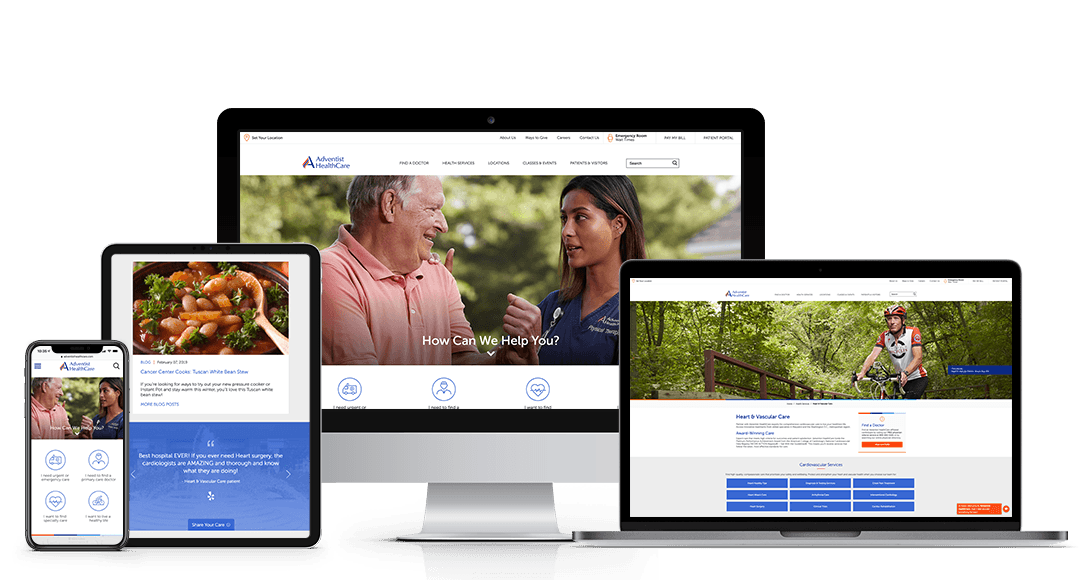
| Adventist HealthCare, a Maryland-based system, had big goals for their new website, from representing their services from a system-wide perspective to anticipating and meeting the needs of their consumers with user-focused, location-optimized content. To accomplish those goals, the Adventist HealthCare team partnered with their long-time agency, Geonetric, to ensure the new site made significant strides in engagement and conversion rates. Adventist HealthCare and Geonetric’s expert content strategists, designers, developers, writers, and digital marketers worked collaboratively to deliver a comprehensive user experience (UX) that met Adventist HealthCare’s patients and consumers when they needed it most — when they were making choices related to their health and the health of their loved ones. An alignment of cross-team objectives also ensured freshly written content:
Content Strategy that Aligns Brand GoalsTo get the redesign project started on the right foot, Adventist HealthCare and Geonetric teamed up for two rounds of qualitative and quantitative usability testing on their website navigation and functionality. Geonetric and Adventist HealthCare completed several types of tests including tree testing, in-person testing, heatmap testing, and scroll map testing to get a complete look at user behavior. Since testing happened throughout the redesign, Geonetric was able to tailor recommendations as new data came in. Applying the FindingsWith an in-depth understanding of their users and how they interact with different aspects of the site, the teams knew they needed to focus on a cross-linking strategy throughout the site to guide users to relevant content on services, locations, and providers at Adventist HealthCare. The data-driven content strategy helped:
The site’s new information architecture, section structures, and shift to streamlined content created a seamless online experience for site visitors. Patient Journey MappingThe Geonetric content team built user-focused service-line and non-service line structures that follow an order that’s logical to the reader and helps them understand typical experiences so they can better navigate what can sometimes be a confusing or intimidating industry. Care was taken to allow readers to enter service-line content related to where they are in their own personal healthcare journey, whether it was in the prevention, diagnosis, treatment, or follow-up care stages, in order to:
Geonetric wrote engaging, actionable language to help site visitors quickly find paths to different care options when they enter the site on popular pages, such as service-line landing pages or the homepage. Geonetric’s design team developed icons that are easy to understand and offer patient-journey-focused clickable circles that easily show the way. Patient-centric Content DevelopmentThrough the content development portion of the project, Geonetric put patients first by:
Patient EngagementWith the goal to create a more accessible entry into care and to help users find the information, they need faster. In a month, Adventist HealthCare saw a 31 percent increase in users who enter the site on one of the service-line pages and a 40 percent decrease in bounce rate in this section. |
Patient Journey Mapping & Data-Driven Content Strategy


