“Geonetric’s team was a great partner, navigating the site redesign, integrating two platforms, and overall helping us to reimagine the potential of our blog. The result is a site that offers an exceptional user experience and leverages our content marketing efforts to help patients find what they need.”
Former Marketing Strategist
Altru Health System
The team at Altru Health System, located in Grand Forks, ND, has been blogging for years.
In the beginning, they had five separate blogs. In their second iteration, they brought those five together as one, but the experience still didn’t feel as cohesive as it could be.
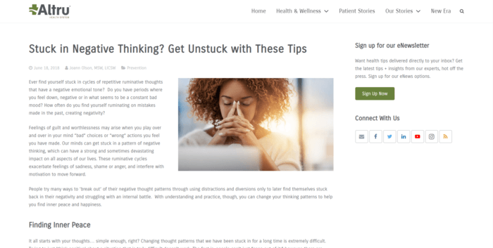
With the latest iteration, launched in March 2018, the Altru team wanted to create more of a wellness and lifestyle experience, moving away from a standard blog with a running list of topics and instead providing intuitive navigation that gives users the freedom to browse high-level topics of interest.
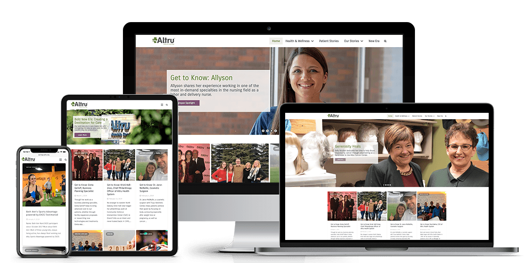
Working with their long-time digital agency, Geonetric, the teams created a solution that streamlines the experience, offering health and wellness information as well as patient stories, employee spotlights, and Altru system news — all in a beautiful, responsive design that integrates with the larger Altru website.
Creating High-quality Content
Altru already had a proven track record of developing compelling content for their patients and communities but really wanted to expand and deepen content on the new site, creating a network of related posts readers could continue to enjoy by topic or category. The Altru marketing team also works diligently to repurpose their already-impressive content library by reusing content that’s evergreen and proven performers.
Current and prospective patients aren’t the new blog’s only target audiences. Altru also wanted to shine a spotlight on their employees, sharing stories about what it’s like to work at Altru and how it’s a place you can grow and evolve as an employee.
The Altru team also focused content on donors and volunteers. With numerous ways to show support and around 300 community members volunteering annually, Altru wanted to be sure to share stories about the way the community steps up to impact the lives of others.
Engaging Design
The visual draw of the site is strong, with magazine-quality imagery and social-media-inspired card design. The blog is built in WordPress, and the Geonetric team worked with Altru to ensure the theme supported Altru’s brand.
The homepage boasts an eye-catching call to action, encouraging site visitors to sign up to get health tips delivered directly to their inbox. The homepage slider features the top four stories, quickly connecting returning visitors to new content and inspiring them to click. It also highlights featured authors, including doctors and dieticians, with headshots and bios that appear with a rollover effect.
Over the last year, the Altru team has worked to incorporate more video throughout the site since creating content in more than one format makes it easier and more engaging to promote on social media platforms.
Altru also shares employee spotlights from the blog on LinkedIn to aid in recruitment efforts.

Integrating Across the Site
The Altru system website underwent an award-winning redesign on their content management system, VitalSite, at the same time the new lifestyle site was created. The Geonetric team worked to establish thoughtful taxonomy and categorization to ensure stories from their content hub dynamically display on the homepage and related pages throughout the main site, including doctors and service lines.
The Geonetric team was instrumental in ensuring the two systems worked together and shared content, allowing the team to build strong connections between their content marketing efforts and the services and care they provide. The result? A seamless experience with engaging content that supports site visitors as they research and evaluate different providers and treatment options on their patient journey.
Improving Traffic and Engagement
Since launch, the Altru blog has averaged nearly 5,000 page views each month. Previously, visitors spent an average of 45 seconds on the site, but that’s since doubled, with users engaging for 1:41 minutes on average and visiting more than one story per session. In addition, the majority of the guest author pages have a lower exit rate, below 20 percent, and have an average time on page of 1.5 – 3 minutes, indicating that users are reading the articles.
Mobile was also a huge driver for the redesign, with more than half of their previous blog traffic coming from smartphones and tablets. The improved statistics are supported by the enhanced navigation and responsive experience delivered to users on mobile devices.
Hospital Blog Transitions to Lifestyle Site Focused on Health, Wellness, and Patient Stories


