“Geonetric’s expertise in both design and content contrary helped us enhance the user experience in meaningful ways. The result is a new intranet that not only represents the breadth of tools and resources available but also enhances daily work, empowers employees, and encourages engagement.”
Jamey Zerr, Digital Specialist
Avera
Finding Value from Internal Input
The primary objective of Avera’s intranet redesign was to help employees get the information they need to do their job quickly and effectively. The intranet team at Avera knew they had to look for internal stakeholders to achieve their goals. To get the inside scoop they:
- Launched an employee survey with 970 participants
- Ran a virtual card sorting exercise with 33 participants across various roles
- Reviewed user data and analytics trends, including an in-depth look at site search volumes to identify specific tools that didn’t have an obvious home on the site or were too deep to find easily
- Implemented heat-mapping to see interaction and engagement trends on the homepage and other key pages
- Analyzed ongoing internal requests for intranet updates to identify themes
Avera’s core governance team of internal communications staff also took feedback from the wealth of employee and physician input on the needs and desires for the future intranet when creating their new site.
Using The Findings
Conclusions from the employee survey, data, and card sorting exercise became the outline for the team’s vision of an enhanced, user-focused intranet, such as:
- Users visit KnowledgeNet frequently and use it to find a variety of resources, native and off-site
- Most users found value in tools and apps, news, topical resources areas (HR/benefits, educational materials, IT needs, etc.)
- Users would like to see improvement with site search, navigation, links to tools, and mobile site access
- Users think about resources in a topical, related fashion, not by department ownership
- Different users expect to access tools in different ways
Delivering a User-focused Intranet
After investing in research, the team was able to build a new intranet with user-focused content strategy and design. The new KnowledgeNet offers:
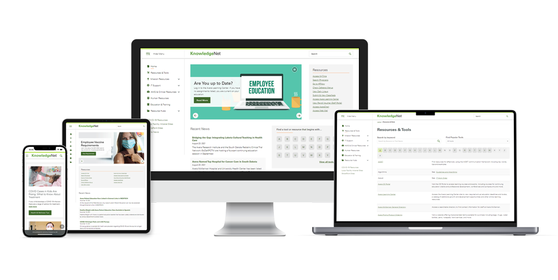
- A mobile-friendly, app-like design
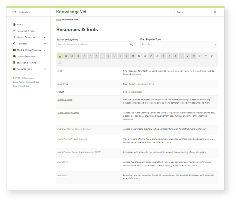
- A user-friendly and intuitive sitewide navigation
- An improved A-Z list of resources that allows users to search by keyword or tool name
- A news feed with thumbnail images
- Engagement-focused homepage elements like digital employee greeting cards
- A three-panel engagement element that updates regularly with blog posts, appreciation stories and current job opportunities

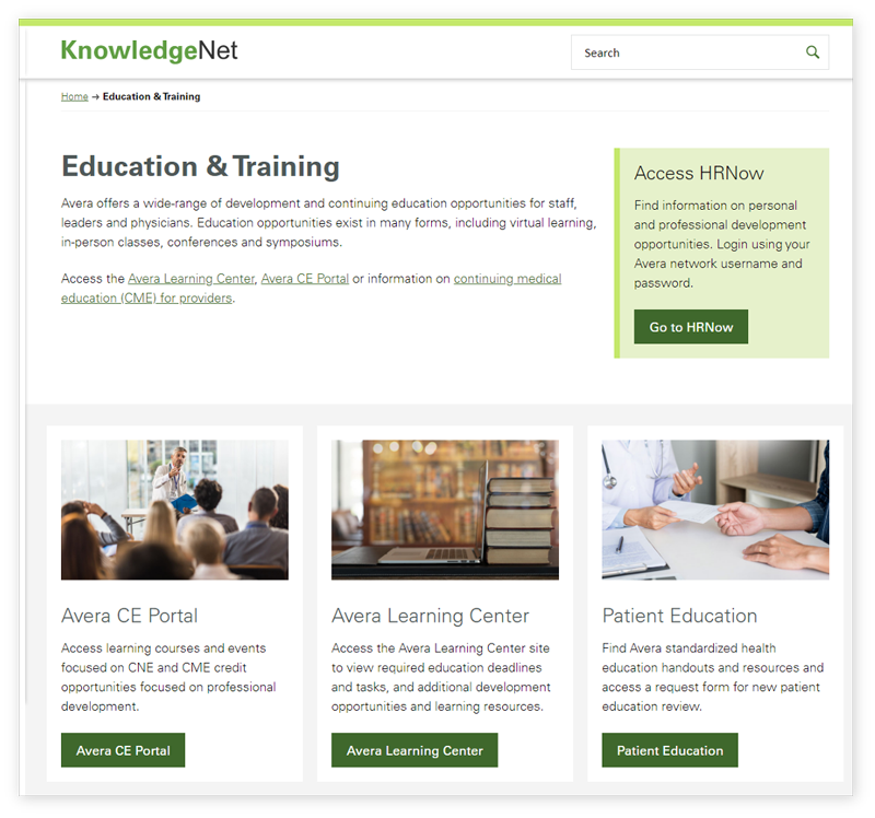
In addition, popular landing pages, such as Education & Training and Employee Wellness Resources, put tools and information front and center, combining information into user-focused hubs versus siloed departments.

Content strategy helps Avera cross-link to other sections and resources to help their employees quickly locate the information they need. This approach helps make the new site manageable for users.
Committing to Content Governance
To maintain their commitment to keeping the intranet site user-focused, not departmental, Avera worked to shift how their teams saw KnowledgeNet, as a hub for many resources.
The core governance team met weekly before launch to review requests, resources, data, and opportunities to map out and document their governance plan. With the help of consulting with other discipline partners and senior leadership input, they created a governance plan that covers the broad range of banner implementation to adding news and making adjustments to the new resources or sections.
This shift allowed the intranet committee to have a purposeful content strategy to deliver information that enhances employees’ daily work, empowers employees as brand champions, and encourages more engagement.
Promoting by Roadshow & Results
Avera’s intranet team went on a roadshow before launching the new intranet. They met with leadership groups, key stakeholders, and other audiences to tell them what to expect, demonstrate new features and celebrate the new design and functionality.
Internal feedback since launch has been positive, and the new platform crucial for allowing the internal communications team to communicate timely information during the pandemic.
Positive data and usage trends continue to show growth and engagement in key areas, including:
- 173% increase in resource and tools traffic
- 77% increase in card interactions
- 10% increase in news stories views
- 5.4% increase in overall site page views
In addition, KnowledgeNet recently took home a gold in the Web Element – Intranet category at the 2021 MarCom awards.
Building a User-Centered Intranet Through Stakeholder Input and Content Strategy


