Help even the most uncertain patient understand your organization’s care options—and which is right for their health needs in the moment—when you follow these tips.
Your website is the place where you can showcase all the types of care you offer and strategically guide people to the option that’s best for their symptoms or condition. Choosing the right care setting—whether that’s a primary care clinic, an urgent care center, a virtual visit, or the emergency department—can save patients money and time, and improve their satisfaction with your organization.
1. Use Your Homepage Effectively
If guiding patients to appropriate care settings is a high priority, build a homepage that helps you meet that goal.
Your homepage is probably the most visited page of your site. Focus its valuable “above-the-fold” space on connecting users with the type of care that’s right for them. Use design, functionality, and content to showcase the options your patients have to choose from, and then give them an easy way to learn more.
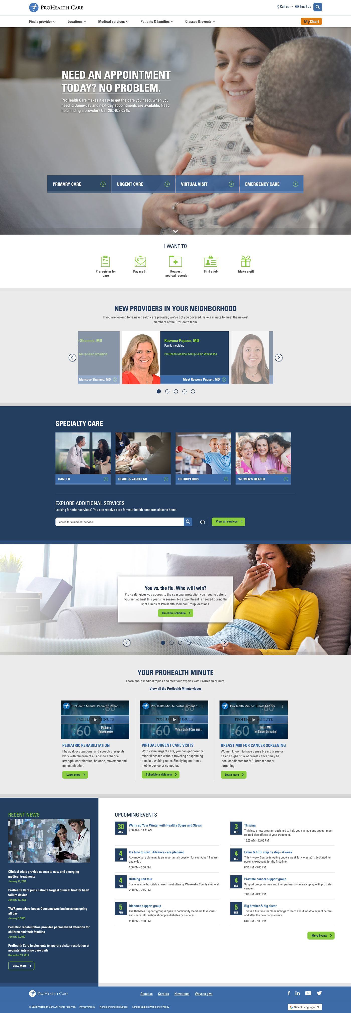
An Example: ProHealth
ProHealth Care’s homepage focuses on helping users learn about same-day and next-day care options. Whether users are on desktop or mobile, choices for quick care are front and center. Once they’re ready to learn more, they can click on the name of the service to see how to take the next step.

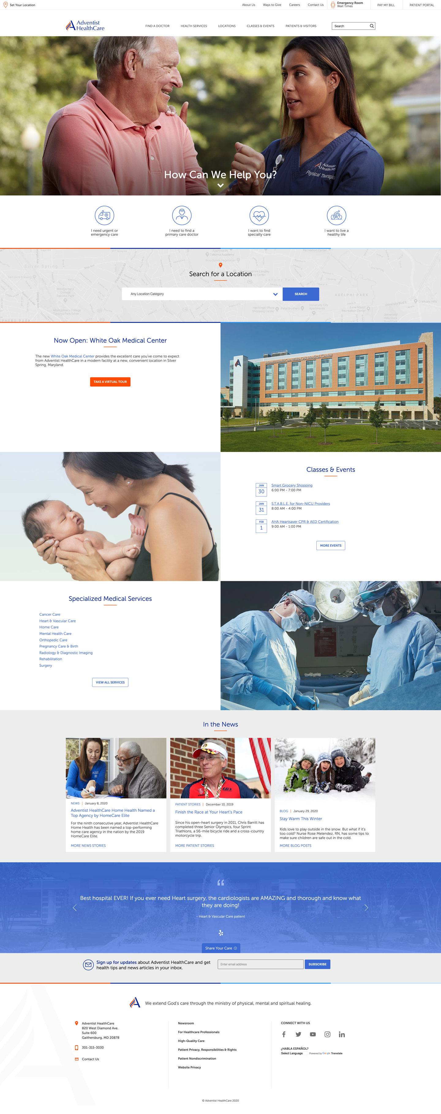
Another Example: Adventist HealthCare
Adventist HealthCare’s home page uses buttons to represent a continuum of care and funnel patients to content about the type of care they need. Depending on where they are in their health care journey, users might opt to learn about living a healthy life, or they may choose to focus on primary, specialty, or urgent or emergency care.

2. Make It Easy to Compare Care Options
Patients don’t always know where to go for care—and they’re looking to you for guidance. It’s essential to present information on your care options in a way that’s easy to understand.
Create a great user experience by using content and design to make it easy for patients to compare their options for quick care when they’re sick.
Show pertinent information about each quick care option – primary care, urgent care, retail clinics, virtual visits, etc. – in one place so users don’t have to hunt for information across your site.
An Example: Rush Copley Medical Center
Rush Copley Medical Center in Aurora, Illinois, found success by creating a “Where to Go for Care” page in their health services section.
Rush Copley uses subheadings to identify and guide readers through their care options. Each care option lists services available and conditions treated to help readers determine the best place for care. The page also features a short video and a PDF users can download and print.
To help readers understand the importance of choosing the right type of care, Rush Copley explains the benefits of how going to the right place of time can save time and money.
3. Optimize Service Line Content
When you follow web writing best practices, you’ll build service line content that’s appreciated by both users and search engines.
Dive into keyword research to see how consumers in your area talk about each service and what questions they’re asking. Then, develop content that answers these questions and naturally incorporates priority keywords.
Keyword research related to walk-in care often reveals phrases such as “when to go to urgent care”“urgent care near me,” and “paying for urgent care.” Symptoms also are frequently searched.
Help users engage with your service line content by
- Focusing on your user
- Keeping content simple and easy to scan
- Cross-linking to related content, such as location profiles and related service lines
- Including a strong call to action
An Example: Olmsted Medical Center
Improve user experience by creating actionable content that cross-links to relevant information like Olmstead Medical Center’s convenient care page does. This helps readers easy move through your site and understand the next steps they need to take to receive care.
Grow your monthly pageviews when you follow our web writing tips to develop content for service lines like telemedicine and urgent care.
Olmsted Medical Center made similar updates to their content and are enjoying an impressive year-over-year increase in pageviews, including a 25% increase to their convenient care page.
4. Prioritize the Mobile Experience
Cone Health partnered with Geonetric to focus their homepage on the idea of “right care, right place, right time.” It was important to the organization to make sure both desktop and mobile users could easily learn about and connect with a wide range of services. User research helped the team develop a dynamic homepage that’s well-received—and well-used—by patients.

What’s Your Approach?
Need help determining the best approach to helping consumers understand their options for care at your organization? Contact us. Geonetric’s content strategists and writers understand the complexity of health care and know how to write content that users and search engines love.


